
Rebuilding A Color System
From inconsistent colors to a scalable token architecture.

duration
3 months
tools
Figma / Github
my role
I owned the design-system update, from auditing the existing colors to rebuilding them as a documented token system.



Rebuilding A Color System
From inconsistent colors to a scalable token architecture.
duration
3 months
tools
Figma / Github
my role
I owned the design-system update, from auditing the existing colors to rebuilding them as a documented token system.
Rebuilding A Color System
From inconsistent colors to a scalable token architecture.
duration
3 months
tools
Figma / Github
my role
I owned the design-system update, from auditing the existing colors to rebuilding them as a documented token system.
Rebuilding A Color System
From inconsistent colors to a scalable token architecture.
duration
3 months
tools
Figma / Github
my role
I owned the design-system update, from auditing the existing colors to rebuilding them as a documented token system.
The TDM Calculator is a web app that city agencies, project applicants, and development professionals use to navigate and comply with Los Angeles Transportation Demand Management regulations. It's built and maintained by a volunteer team at Hack for LA, with designers and engineers rotating on and off over the years, which is how the inconsistencies piled up. I joined as a UX designer and took ownership of the design-system update. The product spans user-facing, admin, and security screens, so a color decision doesn't live in one place, it has to hold across the whole system.
LA parents feel overwhelmed by the mental load of finding and planning family activities because event information is scattered and hard to trust.

The product spans user-facing, admin, and security screens, so a color decision doesn't live in one place, it has to hold across the whole system.
LA parents feel overwhelmed by the mental load of finding and planning family activities because event information is scattered and hard to trust.
The Assignment
It started with a small assignment:
It started with a small assignment:
The Thread
That one mismatch was a thread. I audited every overlay and found the same problems in all of them, then followed the grays down to their tokens and audited every color in the system. None of it was isolated.
Three things stood out that were not equally serious:
Red flags. Accessibility and brand violations sitewide in the code, and a made-up token.
Discrepancies. Figma and production had drifted apart, so neither could be trusted as the source of truth.
Smaller tells. Like buttons that weren't centered. Minor alone, but on a public agency's tool, sloppiness signals a system that isn't maintained with care.
Nothing was being enforced.
The Design System
Sort
A-Z
Sort
Z-A
RESET
APPLY
The Dev-Site

The Design System
#939393
theme.js value
#939393
Both are labeled #939393. They don't match. Which one is right?
Turns out “Gray” in the design system was made up of three layers that add up to #5E5E5E, the value it should have been in the first place.
Red Flags
1
X-close tap target: below the WCAG minimum on the dev site
2
Text color: #000000 is not a LADOT brand color, should be Soft Black #231F20
3
Gray token: mislabeled and inaccurate in the design system
Discrepancies
4
X-close icon: size and padding
5
Radio button: vector weight
6
Separator: width and length
7
Button: height and shadow
8
Overlay: width
9
Padding and spacing: across the overlay
10
Input field: size, border color, placeholder text, and search icon size and placement
The causes were not a mystery:
It's a volunteer-run project, with designers cycling on and off at different stages.
The existing design system was vague and thinly documented.
Variable collections were built around color names instead of function, so designers picked by how a color looked, or by loose usage notes, rather than the job it did.
The result showed up in the grays: the same job often had a different gray behind it, eleven in all before the cleanup.

#808080
Disabled numbers, excluding the number of the current active page (1)

#CFCFCF
Disabled `Rename Snapshot` text & icon

#EEF1F4 Disabled toolbar icon
Three different grays, all doing 'disabled,' on the live site.
How do we build a design system that current and future designers and engineers can all follow without guessing?
The fix
The obvious fix was to pick better grays. The real fix was to build a system that made the right color easier to identify and apply consistently. I worked with a PM and an engineer to audit the code, and audited the entire design system component by component. The mismatch between the documented palette and the actual components was everywhere.
How I chose each value
Picking the grays wasn't about redrawing a prettier scale. Each choice balanced three things:
1
What was already coded.
Reusing hardcoded values where I could, so the system didn't create a migration project for the engineers.
2
What stakeholders had approved.
Reusing signed-off values where I could, and weighing whether a change would visibly depart from approved designs or go unnoticed against them.
3
What met accessibility standards.
The non-negotiable floor. When a value failed contrast, it changed, regardless of the other two.

The inherited palette. The rules lived in prose notes, not the tokens themselves, which left them ambiguous.
So I rebuilt the color portion of the design system in three levels: Primitive, Semantic, and Component.
Primitive
gray/0 - gray/950, plus navy, blue, green, and the status hues - values that nobody is meant to use directly.
Semantic
The job lives in the semantic token, which resolves to a primitive value.
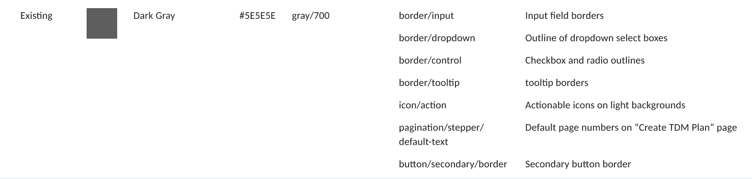
border/input resolves to the gray that clears 3:1, text/placeholder to the gray that clears 4.5:1, so the contrast rule is built into the assignment, not remembered by a person.

Two interaction blues shipped in the UI with no token behind them, invisible to the system.
Component
The specific cases that need their own treatment, named by component and state. button/primary/background, pagination/table/current-text, date-picker/focus-background.
When a control does something the semantic layer doesn't cover, it gets a token that says exactly where it lives, so its color can change without touching anything else.
AI-assisted audit reconciliation
AI-assisted audit reconciliation
I used AI to cross-check the real code inventory against my working token tables, helping verify which discrepancies had already been resolved in the actual token system and which still needed attention.
Now the name does the deciding.
A new designer on the project needing an input field, reaches for border/input token and gets the value that clears contrast, without ever looking up a hex or a WCAG number. They inherit the reasoning, not just the color. That is the difference between a palette you have to understand and a system you can follow without guessing.

The rebuilt system in Figma using variables. The token name carries the job, so the value is never a guess.
What the system replaced the guessing with:
20
Primitive Tokens
The raw palette. The only place a hex lives.
46
Semantic Tokens
Every value bound to a job and its rule.
11 → 7
Grays, Governed
Consolidated from a scattered set, each pinned to a role and a contrast rule.
Named by function, not appearance, so the next designer or engineer inherits the reasoning instead of guessing.


Cleaning a design system is governance, not decoration.
The hard problems were decisions: which values were intentional and which were leftovers, what to consolidate, where accessibility should override a legacy choice, and when not to add a token at all. The existing palette was the artifact. The real work was building a system that makes those calls for the next person, so they inherit the reasoning instead of re-making it.
The Dev-Site
The Rebuild
Sort A-Z
Sort Z-A
Select all 280
|
Clear
0 selected
Development Project Name
Anza Apartments 1
Anza Apartments 3
2566 Test Submit
2865 snapshot
2nd copy snapshot
4 Snapshot 1
RESET
Apply
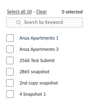
Where it started and where it landed. The overlay I was assigned to build, rebuilt on the token system, every color now resolving to a semantic token and clearing its contrast rule.
Selected changes:
Input field
#5E5E5E
border
#757575
placeholder
border/input
#5E5E5E
|
6.5:1
|
non-text
1.4.11
text/placeholder
#757575
|
4.6:1
|
text
1.4.3
One shared gray became two tokens, each cleared against the rule its job answers to.
X-close target
Before: 16x16
After: 44x44
icon/close
#231F20
|
gray/950
16x16 fails 2.5.8 (AA) → 44x44 meets
2.5.5 (AAA)
The tap target went from 16x16 below the AA minimum, to 44x44 clearing the AAA standard.
Apply button
APPLY
button/primary/background
#A7C539
|
green/500
pagination/stepper/current-background
#A7C539
|
green/500
One green served two different jobs, a primary button and the current step in the TDM form. Both now resolve to green/500 through their own tokens.
Where it stands
The color system is complete in Figma and ready for design-team review. What started as an inconsistent palette is now a structured set of tokens with defined roles, documented usage, and accessibility requirements built into the color assignments.
For designers, the file provides a clear reference for choosing colors by function instead of appearance. For engineers, it establishes a documented mapping between the new tokens and the values already used in the application.
The next step is to review the system with the design team, incorporate feedback, and prepare the approved file for LADOT handoff. The production code still contains the hardcoded and duplicated values identified during the audit.
Complete
Color System
Tokens, accessibility decisions and Figma documentation.
In Progress
Code alignment
Reconcile existing hardcoded values with the new tokens.
Up Next
Team review
Gather feedback and prepare the approved handoff.
What’s next
Color was the proof of concept. The same method, audit, find the functional logic, build tiered tokens, extends to the rest of the foundation: typography, spacing, icons, elevation, and the interaction and layout systems that sit on top of them. Governance is the throughline that keeps all of it from drifting again.
A system only holds if it's maintained. The next challenge is making sure these decisions stay clear and usable as the team changes.
Rebuilding A Color System
From inconsistent colors to a scalable token architecture.
duration
3 months
tools
Figma / Github
my role
I owned the design-system update, from auditing the existing colors to rebuilding them as a documented token system.
Rebuilding A Color System
From inconsistent colors to a scalable token architecture.
duration
3 months
tools
Figma / Github
my role
I owned the design-system update, from auditing the existing colors to rebuilding them as a documented token system.
Rebuilding A Color System
From inconsistent colors to a scalable token architecture.
duration
3 months
tools
Figma / Github
my role
I owned the design-system update, from auditing the existing colors to rebuilding them as a documented token system.
Rebuilding A Color System
From inconsistent colors to a scalable token architecture.
duration
3 months
tools
Figma / Github
my role
I owned the design-system update, from auditing the existing colors to rebuilding them as a documented token system.
The TDM Calculator is a web app that city agencies, project applicants, and development professionals use to navigate and comply with Los Angeles Transportation Demand Management regulations. It's built and maintained by a volunteer team at Hack for LA, with designers and engineers rotating on and off over the years, which is how the inconsistencies piled up. I joined as a UX designer and took ownership of the design-system update. The product spans user-facing, admin, and security screens, so a color decision doesn't live in one place, it has to hold across the whole system.
LA parents feel overwhelmed by the mental load of finding and planning family activities because event information is scattered and hard to trust.
The product spans user-facing, admin, and security screens, so a color decision doesn't live in one place, it has to hold across the whole system.
LA parents feel overwhelmed by the mental load of finding and planning family activities because event information is scattered and hard to trust.
The Assignment
It started with a small assignment:
It started with a small assignment:
The Thread
That one mismatch was a thread. I audited every overlay and found the same problems in all of them, then followed the grays down to their tokens and audited every color in the system. None of it was isolated.
Three things stood out that were not equally serious:
Red flags. Accessibility and brand violations sitewide in the code, and a made-up token.
Discrepancies. Figma and production had drifted apart, so neither could be trusted as the source of truth.
Smaller tells. Like buttons that weren't centered. Minor alone, but on a public agency's tool, sloppiness signals a system that isn't maintained with care.
Nothing was being enforced.
The Design System
Sort
A-Z
Sort
Z-A
RESET
APPLY
The Dev-Site
The Design System
#939393
theme.js value
#939393
Both are labeled #939393. They don't match. Which one is right?
Turns out “Gray” in the design system was made up of three layers that add up to #5E5E5E, the value it should have been in the first place.
Red Flags
1
X-close tap target: below the WCAG minimum on the dev site
2
Text color: #000000 is not a LADOT brand color, should be Soft Black #231F20
3
Gray token: mislabeled and inaccurate in the design system
Discrepancies
4
X-close icon: size and padding
5
Radio button: vector weight
6
Separator: width and length
7
Button: height and shadow
8
Overlay: width
9
Padding and spacing: across the overlay
10
Input field: size, border color, placeholder text, and search icon size and placement
The causes were not a mystery:
It's a volunteer-run project, with designers cycling on and off at different stages.
The existing design system was vague and thinly documented.
Variable collections were built around color names instead of function, so designers picked by how a color looked, or by loose usage notes, rather than the job it did.
The result showed up in the grays: the same job often had a different gray behind it, eleven in all before the cleanup.
#808080
Disabled numbers, excluding the number of the current active page (1)
#CFCFCF
Disabled `Rename Snapshot` text & icon
#EEF1F4 Disabled toolbar icon
Three different grays, all doing 'disabled,' on the live site.
How do we build a design system that current and future designers and engineers can all follow without guessing?
The fix
The obvious fix was to pick better grays. The real fix was to build a system that made the right color easier to identify and apply consistently. I worked with a PM and an engineer to audit the code, and audited the entire design system component by component. The mismatch between the documented palette and the actual components was everywhere.
How I chose each value
Picking the grays wasn't about redrawing a prettier scale. Each choice balanced three things:
1
What was already coded.
Reusing hardcoded values where I could, so the system didn't create a migration project for the engineers.
2
What stakeholders had approved.
Reusing signed-off values where I could, and weighing whether a change would visibly depart from approved designs or go unnoticed against them.
3
What met accessibility standards.
The non-negotiable floor. When a value failed contrast, it changed, regardless of the other two.
The inherited palette. The rules lived in prose notes, not the tokens themselves, which left them ambiguous.
So I rebuilt the color portion of the design system in three levels: Primitive, Semantic, and Component.
Primitive
gray/0 - gray/950, plus navy, blue, green, and the status hues - values that nobody is meant to use directly.
Semantic
The job lives in the semantic token, which resolves to a primitive value.
border/input resolves to the gray that clears 3:1, text/placeholder to the gray that clears 4.5:1, so the contrast rule is built into the assignment, not remembered by a person.
Two interaction blues shipped in the UI with no token behind them, invisible to the system.
Component
The specific cases that need their own treatment, named by component and state. button/primary/background, pagination/table/current-text, date-picker/focus-background.
When a control does something the semantic layer doesn't cover, it gets a token that says exactly where it lives, so its color can change without touching anything else.
AI-assisted audit reconciliation
AI-assisted audit reconciliation
I used AI to cross-check the real code inventory against my working token tables, helping verify which discrepancies had already been resolved in the actual token system and which still needed attention.
Now the name does the deciding.
A new designer on the project needing an input field, reaches for border/input token and gets the value that clears contrast, without ever looking up a hex or a WCAG number. They inherit the reasoning, not just the color. That is the difference between a palette you have to understand and a system you can follow without guessing.
The rebuilt system in Figma using variables. The token name carries the job, so the value is never a guess.
What the system replaced the guessing with:
20
Primitive Tokens
The raw palette. The only place a hex lives.
46
Semantic Tokens
Every value bound to a job and its rule.
11 → 7
Grays, Governed
Consolidated from a scattered set, each pinned to a role and a contrast rule.
Named by function, not appearance, so the next designer or engineer inherits the reasoning instead of guessing.
Cleaning a design system is governance, not decoration.
The hard problems were decisions: which values were intentional and which were leftovers, what to consolidate, where accessibility should override a legacy choice, and when not to add a token at all. The existing palette was the artifact. The real work was building a system that makes those calls for the next person, so they inherit the reasoning instead of re-making it.
The Dev-Site
The Rebuild
Sort A-Z
Sort Z-A
Select all 280
|
Clear
0 selected
Development Project Name
Anza Apartments 1
Anza Apartments 3
2566 Test Submit
2865 snapshot
2nd copy snapshot
4 Snapshot 1
RESET
Apply
Where it started and where it landed. The overlay I was assigned to build, rebuilt on the token system, every color now resolving to a semantic token and clearing its contrast rule.
Selected changes:
Input field
#5E5E5E
border
#757575
placeholder
border/input
#5E5E5E
|
6.5:1
|
non-text
1.4.11
text/placeholder
#757575
|
4.6:1
|
text
1.4.3
One shared gray became two tokens, each cleared against the rule its job answers to.
X-close target
Before: 16x16
After: 44x44
icon/close
#231F20
|
gray/950
16x16 fails 2.5.8 (AA) → 44x44 meets
2.5.5 (AAA)
The tap target went from 16x16 below the AA minimum, to 44x44 clearing the AAA standard.
Apply button
APPLY
button/primary/background
#A7C539
|
green/500
pagination/stepper/current-background
#A7C539
|
green/500
One green served two different jobs, a primary button and the current step in the TDM form. Both now resolve to green/500 through their own tokens.
Where it stands
The color system is complete in Figma and ready for design-team review. What started as an inconsistent palette is now a structured set of tokens with defined roles, documented usage, and accessibility requirements built into the color assignments.
For designers, the file provides a clear reference for choosing colors by function instead of appearance. For engineers, it establishes a documented mapping between the new tokens and the values already used in the application.
The next step is to review the system with the design team, incorporate feedback, and prepare the approved file for LADOT handoff. The production code still contains the hardcoded and duplicated values identified during the audit.
Complete
Color System
Tokens, accessibility decisions and Figma documentation.
In Progress
Code alignment
Reconcile existing hardcoded values with the new tokens.
Up Next
Team review
Gather feedback and prepare the approved handoff.
What’s next
Color was the proof of concept. The same method, audit, find the functional logic, build tiered tokens, extends to the rest of the foundation: typography, spacing, icons, elevation, and the interaction and layout systems that sit on top of them. Governance is the throughline that keeps all of it from drifting again.
A system only holds if it's maintained. The next challenge is making sure these decisions stay clear and usable as the team changes.
Rebuilding A Color System
From inconsistent colors to a scalable token architecture.
duration
3 months
tools
Figma / Github
my role
I owned the design-system update, from auditing the existing colors to rebuilding them as a documented token system.
Rebuilding A Color System
From inconsistent colors to a scalable token architecture.
duration
3 months
tools
Figma / Github
my role
I owned the design-system update, from auditing the existing colors to rebuilding them as a documented token system.
Rebuilding A Color System
From inconsistent colors to a scalable token architecture.
duration
3 months
tools
Figma / Github
my role
I owned the design-system update, from auditing the existing colors to rebuilding them as a documented token system.
Rebuilding A Color System
From inconsistent colors to a scalable token architecture.
duration
3 months
tools
Figma / Github
my role
I owned the design-system update, from auditing the existing colors to rebuilding them as a documented token system.
The TDM Calculator is a web app that city agencies, project applicants, and development professionals use to navigate and comply with Los Angeles Transportation Demand Management regulations. It's built and maintained by a volunteer team at Hack for LA, with designers and engineers rotating on and off over the years, which is how the inconsistencies piled up. I joined as a UX designer and took ownership of the design-system update. The product spans user-facing, admin, and security screens, so a color decision doesn't live in one place, it has to hold across the whole system.
LA parents feel overwhelmed by the mental load of finding and planning family activities because event information is scattered and hard to trust.
The product spans user-facing, admin, and security screens, so a color decision doesn't live in one place, it has to hold across the whole system.
LA parents feel overwhelmed by the mental load of finding and planning family activities because event information is scattered and hard to trust.
The Assignment
It started with a small assignment:
It started with a small assignment:
The Thread
That one mismatch was a thread. I audited every overlay and found the same problems in all of them, then followed the grays down to their tokens and audited every color in the system. None of it was isolated.
Three things stood out that were not equally serious:
Red flags. Accessibility and brand violations sitewide in the code, and a made-up token.
Discrepancies. Figma and production had drifted apart, so neither could be trusted as the source of truth.
Smaller tells. Like buttons that weren't centered. Minor alone, but on a public agency's tool, sloppiness signals a system that isn't maintained with care.
Nothing was being enforced.
The Design System
Sort
A-Z
Sort
Z-A
RESET
APPLY
The Dev-Site
The Design System
#939393
theme.js value
#939393
Both are labeled #939393. They don't match. Which one is right?
Turns out “Gray” in the design system was made up of three layers that add up to #5E5E5E, the value it should have been in the first place.
Red Flags
1
X-close tap target: below the WCAG minimum on the dev site
2
Text color: #000000 is not a LADOT brand color, should be Soft Black #231F20
3
Gray token: mislabeled and inaccurate in the design system
Discrepancies
4
X-close icon: size and padding
5
Radio button: vector weight
6
Separator: width and length
7
Button: height and shadow
8
Overlay: width
9
Padding and spacing: across the overlay
10
Input field: size, border color, placeholder text, and search icon size and placement
The causes were not a mystery:
It's a volunteer-run project, with designers cycling on and off at different stages.
The existing design system was vague and thinly documented.
Variable collections were built around color names instead of function, so designers picked by how a color looked, or by loose usage notes, rather than the job it did.
The result showed up in the grays: the same job often had a different gray behind it, eleven in all before the cleanup.
#808080
Disabled numbers, excluding the number of the current active page (1)
#CFCFCF
Disabled `Rename Snapshot` text & icon
#EEF1F4 Disabled toolbar icon
Three different grays, all doing 'disabled,' on the live site.
How do we build a design system that current and future designers and engineers can all follow without guessing?
The fix
The obvious fix was to pick better grays. The real fix was to build a system that made the right color easier to identify and apply consistently. I worked with a PM and an engineer to audit the code, and audited the entire design system component by component. The mismatch between the documented palette and the actual components was everywhere.
How I chose each value
Picking the grays wasn't about redrawing a prettier scale. Each choice balanced three things:
1
What was already coded.
Reusing hardcoded values where I could, so the system didn't create a migration project for the engineers.
2
What stakeholders had approved.
Reusing signed-off values where I could, and weighing whether a change would visibly depart from approved designs or go unnoticed against them.
3
What met accessibility standards.
The non-negotiable floor. When a value failed contrast, it changed, regardless of the other two.
The inherited palette. The rules lived in prose notes, not the tokens themselves, which left them ambiguous.
So I rebuilt the color portion of the design system in three levels: Primitive, Semantic, and Component.
Primitive
gray/0 - gray/950, plus navy, blue, green, and the status hues - values that nobody is meant to use directly.
Semantic
The job lives in the semantic token, which resolves to a primitive value.
border/input resolves to the gray that clears 3:1, text/placeholder to the gray that clears 4.5:1, so the contrast rule is built into the assignment, not remembered by a person.
Two interaction blues shipped in the UI with no token behind them, invisible to the system.
Component
The specific cases that need their own treatment, named by component and state. button/primary/background, pagination/table/current-text, date-picker/focus-background.
When a control does something the semantic layer doesn't cover, it gets a token that says exactly where it lives, so its color can change without touching anything else.
AI-assisted audit reconciliation
AI-assisted audit reconciliation
I used AI to cross-check the real code inventory against my working token tables, helping verify which discrepancies had already been resolved in the actual token system and which still needed attention.
Now the name does the deciding.
A new designer on the project needing an input field, reaches for border/input token and gets the value that clears contrast, without ever looking up a hex or a WCAG number. They inherit the reasoning, not just the color. That is the difference between a palette you have to understand and a system you can follow without guessing.
The rebuilt system in Figma using variables. The token name carries the job, so the value is never a guess.
What the system replaced the guessing with:
20
Primitive Tokens
The raw palette. The only place a hex lives.
46
Semantic Tokens
Every value bound to a job and its rule.
11 → 7
Grays, Governed
Consolidated from a scattered set, each pinned to a role and a contrast rule.
Named by function, not appearance, so the next designer or engineer inherits the reasoning instead of guessing.
Cleaning a design system is governance, not decoration.
The hard problems were decisions: which values were intentional and which were leftovers, what to consolidate, where accessibility should override a legacy choice, and when not to add a token at all. The existing palette was the artifact. The real work was building a system that makes those calls for the next person, so they inherit the reasoning instead of re-making it.
The Dev-Site
The Rebuild
Sort A-Z
Sort Z-A
Select all 280
|
Clear
0 selected
Development Project Name
Anza Apartments 1
Anza Apartments 3
2566 Test Submit
2865 snapshot
2nd copy snapshot
4 Snapshot 1
RESET
Apply
Where it started and where it landed. The overlay I was assigned to build, rebuilt on the token system, every color now resolving to a semantic token and clearing its contrast rule.
Selected changes:
Input field
#5E5E5E
border
#757575
placeholder
border/input
#5E5E5E
|
6.5:1
|
non-text
1.4.11
text/placeholder
#757575
|
4.6:1
|
text
1.4.3
One shared gray became two tokens, each cleared against the rule its job answers to.
X-close target
Before: 16x16
After: 44x44
icon/close
#231F20
|
gray/950
16x16 fails 2.5.8 (AA) → 44x44 meets
2.5.5 (AAA)
The tap target went from 16x16 below the AA minimum, to 44x44 clearing the AAA standard.
Apply button
APPLY
button/primary/background
#A7C539
|
green/500
pagination/stepper/current-background
#A7C539
|
green/500
One green served two different jobs, a primary button and the current step in the TDM form. Both now resolve to green/500 through their own tokens.
Where it stands
The color system is complete in Figma and ready for design-team review. What started as an inconsistent palette is now a structured set of tokens with defined roles, documented usage, and accessibility requirements built into the color assignments.
For designers, the file provides a clear reference for choosing colors by function instead of appearance. For engineers, it establishes a documented mapping between the new tokens and the values already used in the application.
The next step is to review the system with the design team, incorporate feedback, and prepare the approved file for LADOT handoff. The production code still contains the hardcoded and duplicated values identified during the audit.
Complete
Color System
Tokens, accessibility decisions and Figma documentation.
In Progress
Code alignment
Reconcile existing hardcoded values with the new tokens.
Up Next
Team review
Gather feedback and prepare the approved handoff.
What’s next
Color was the proof of concept. The same method, audit, find the functional logic, build tiered tokens, extends to the rest of the foundation: typography, spacing, icons, elevation, and the interaction and layout systems that sit on top of them. Governance is the throughline that keeps all of it from drifting again.
A system only holds if it's maintained. The next challenge is making sure these decisions stay clear and usable as the team changes.