
overview
TiriVelo is a two-sided marketplace for booking pet care services.
A desktop platform had been designed but had not yet launched. The mobile initiative was an opportunity to translate the experience while also strengthening areas that would affect trust, clarity, and booking success.
Our team owned the pet owner side of the marketplace while a parallel team designed the provider experience. Because booking logic touches both sides, coordination and clear system thinking were critical.
Problem Statement
Urban pet owners struggle to confidently book care through new digital marketplaces.
Booking services for something as personal as pet care introduces anxiety around trust, cost transparency, and what happens after a request is submitted. When these concerns are not clearly addressed, users hesitate or abandon the process.
project scope
Two design teams worked in parallel across the pet owner experience.
My primary ownership:
End-to-end booking architecture
Payment flow
Request lifecycle states
Status visibility
Booking validation logic
Post-service feedback flow to close the booking loop
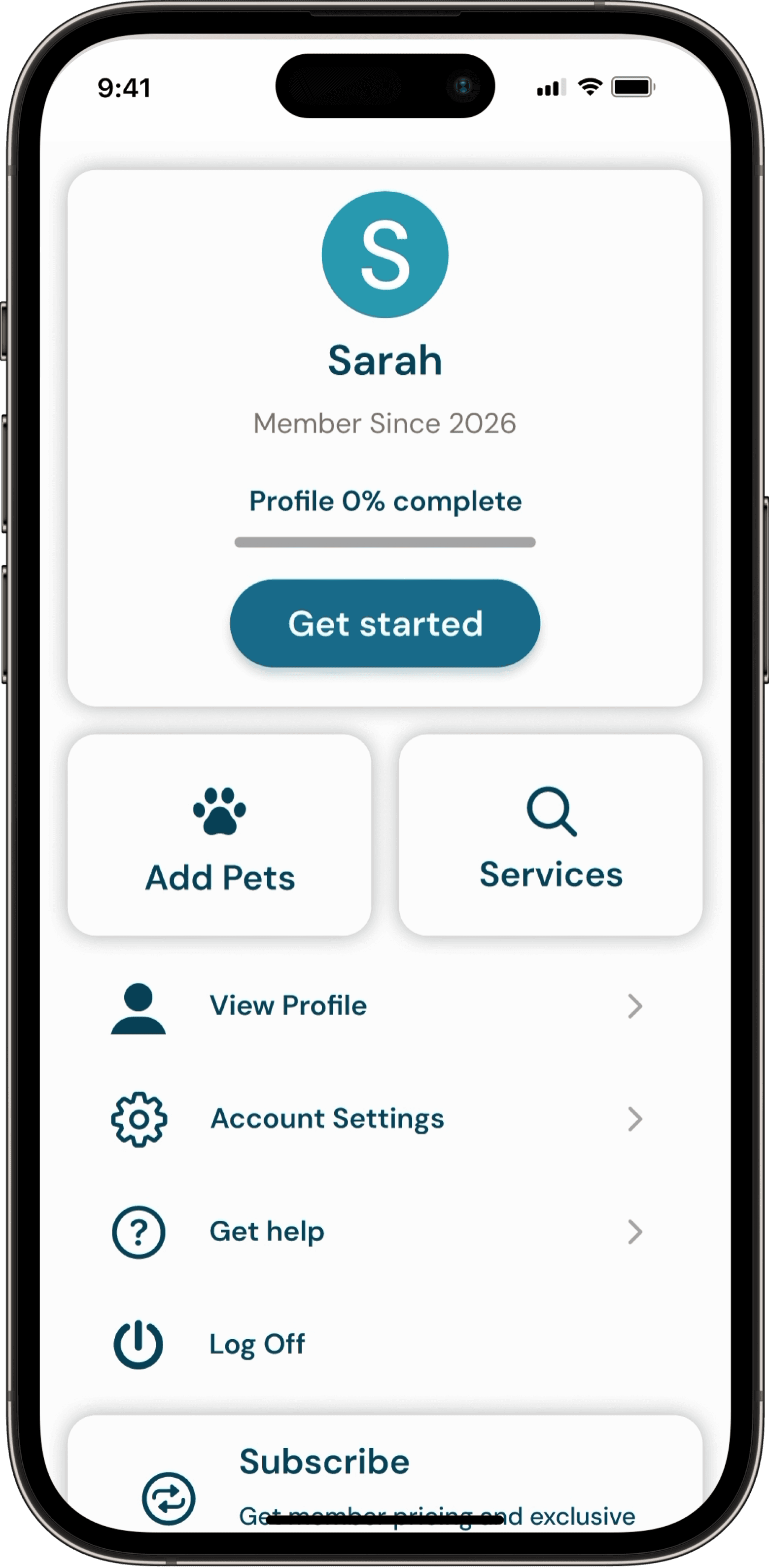
In addition, I co-designed the Owner Onboarding flow to ensure the booking journey could be tested holistically.

Evaluate
Understand what exists and where the risk lives.
Research
I reviewed available research artifacts and prior discovery work to understand user expectations, trust requirements, and common anxieties in booking care for pets. The material reinforced the importance of transparency around cost, clear service definitions, and confidence in what happens after a request is sent.
Competitors
I analyzed comparable marketplace apps to understand how mature products guide users from exploration to commitment. Across the board, successful platforms reduced ambiguity by clarifying pricing early, setting policy expectations before checkout, and maintaining strong visibility into request status.
flow audit
I evaluated the existing desktop foundation to determine how well it would translate to mobile behavior. While it offered a useful starting point, several risks emerged for first time users.

3


1
2

4
5
7
6
Key risks identified.
commitment language appeared before trust was built
service terminology required interpretation
scheduling assumed only a single visit
prices were not visible during decision making
payment and cancellation expectations were undefined
no flows built for incomplete profiles
booking outcomes were unclear
no built in feedback loop
Align
Booking touched both sides of the marketplace, and many of the operational rules were still emerging during the engagement. My role was to absorb new decisions, translate them into the owner experience, and keep the system coherent as definitions evolved.
I worked across teams to align on:
the mobile design system
how availability structures translate into user choices
visit capacity across a single day
request acceptance states
request denial and recovery paths
requirements for a valid transaction
Cross team syncronnization
At the start of the engagement, I established the mobile design system by adapting and extending the desktop foundation for small screens. I expanded typography, defined component behaviors, and built reusable interaction patterns that could scale across the product.
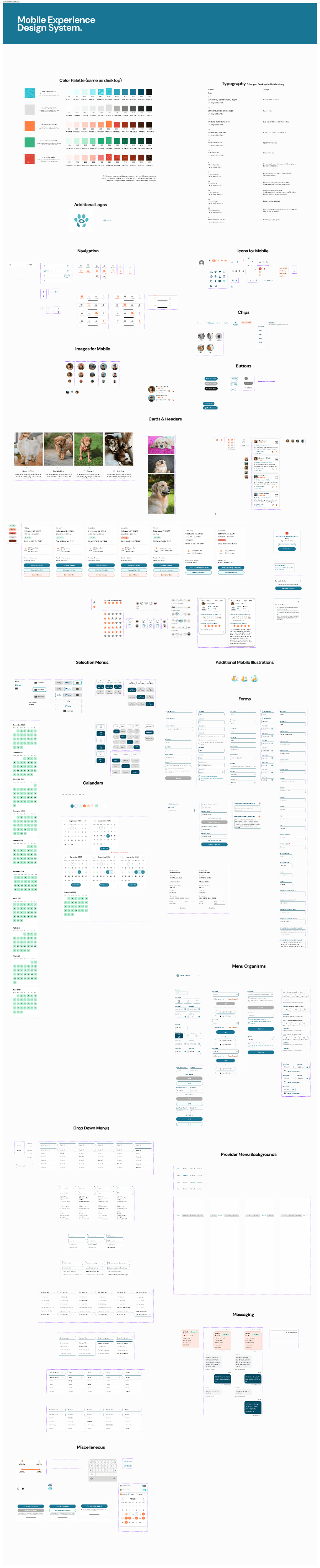

As our system matured, it became the working reference for consistency across the marketplace.
The provider designers adopted these standards to maintain consistency in UI structure, states, and lifecycle communication, which accelerated collaboration and reduced rework.
One key shift involved reframing primary actions. The original language emphasized “Book,” which assumed readiness to commit. For a new marketplace still earning trust, I introduced exploration based wording such as “Search” and “Select a service.” This vocabulary aligned the experience around discovery first, commitment second, and helped create consistency across both sides of the platform.

Operational Alignment
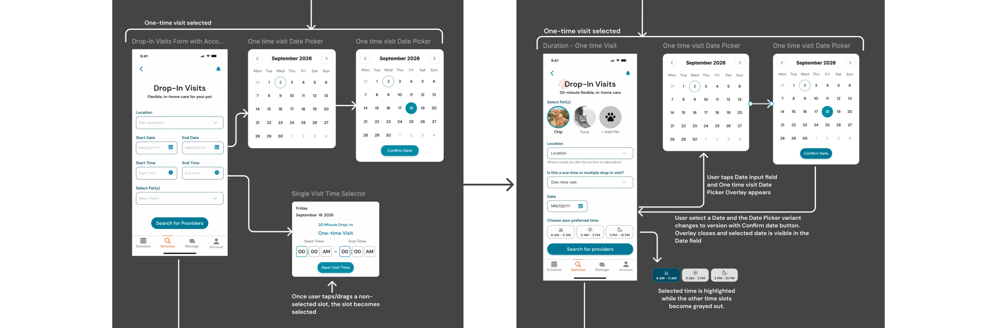
Research across teams showed providers work more effectively in predictable blocks rather than minute by minute appointments. After reviewing this insight, leadership shifted the marketplace from exact times to morning, afternoon, and evening windows.
That decision had significant downstream impact on how visits are configured. To support it, I designed a flexible calendar system that could represent single days, date ranges, multiple visits per day, and validation across time windows. The pattern created a shared structure that worked for both owner booking and provider availability.
In parallel, payment processing expectations, timing, and cancellation consequences were clarified and had not existed in the original desktop foundation. I translated these evolving rules into the journey through updated selection patterns, labels, and constraints so the interface matched real service operations while helping owners understand commitments before submitting a request.
Architect
With the operating direction established, I defined how the booking system should behave in response to user input. My goal was to make complexity manageable, prevent failure states, and ensure continuity after a request was sent.
Interaction logic
I created responsive patterns that adapt as selections change. The flow expands or simplifies depending on visit frequency, number of days, and time windows, revealing only what is necessary at each step.


INTEGRETY RULES
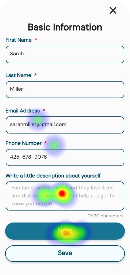
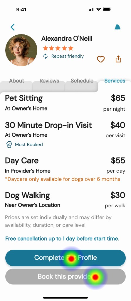
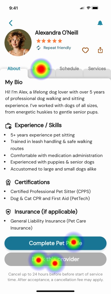
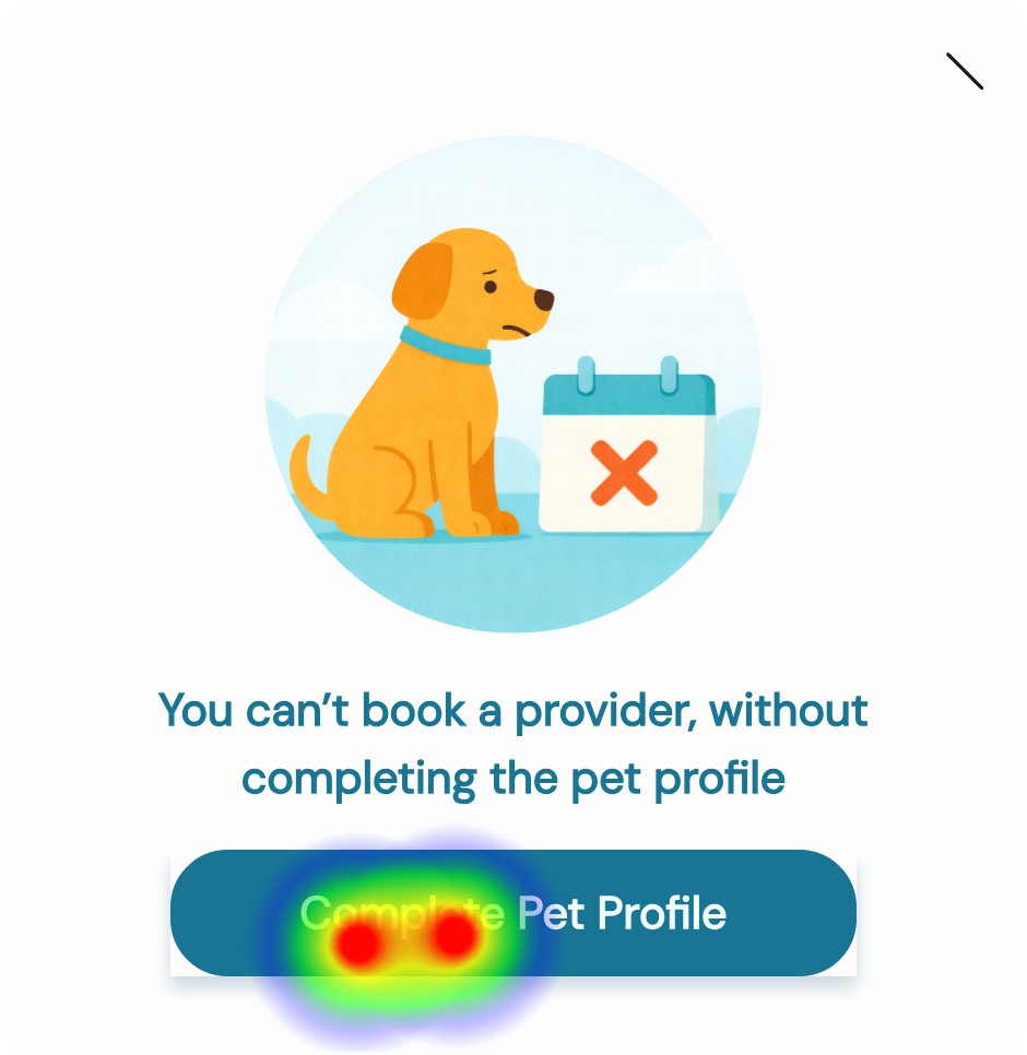
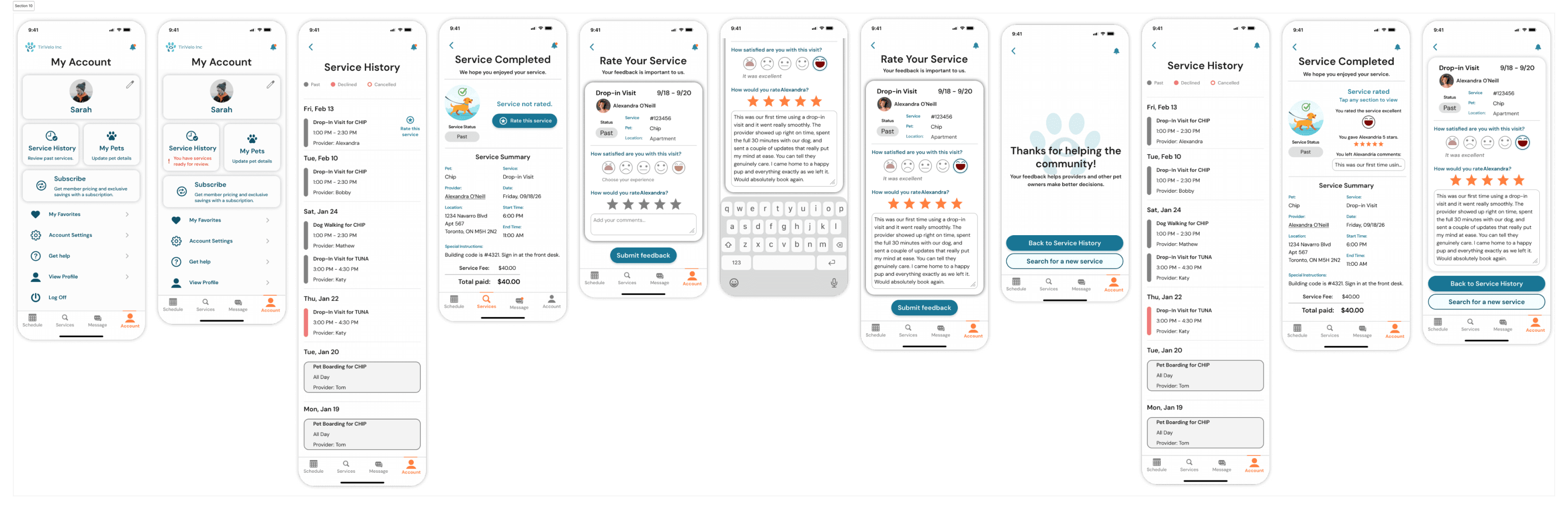
Using an incomplete Pet Profile completion as an example, I established conditions that must be met before submission. Users could not proceed without complete time assignments, required pet details, or compatible configurations. When something was missing, the system provided immediate feedback and a clear path to resolution.

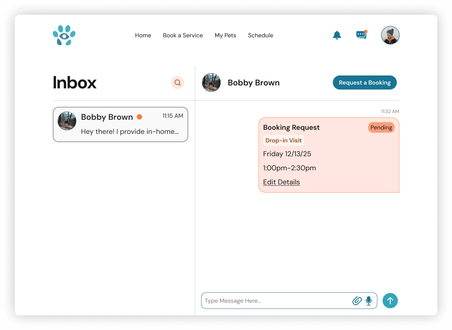
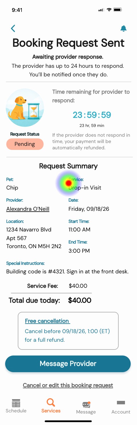
lifecycle behavior
I defined how the experience continues after the request is placed, including pending states, confirmations, unsuccessful outcomes, and recommended alternatives. This ensured users always understood status and next steps.


After service completion, I introduced prompts that allow owners to provide feedback, extending the lifecycle into reputation building.


Design
Design work began early as a way to expose gaps, test assumptions, and make abstract requirements tangible.
As new operational rules and stakeholder direction emerged, I refined the experience to maintain clarity, usability, and system integrity.
core flows
I mapped the primary journeys from service selection through request outcomes, using them as working tools to reveal missing states and decision points.

wireframes
I moved into wireframing quickly to translate concepts into structure. Working in low fidelity allowed me to organize information, establish hierarchy, and understand how the experience should unfold across screens. By making the product visible, I could identify where additional logic, messaging, or constraints were necessary.

High fidelity Screens
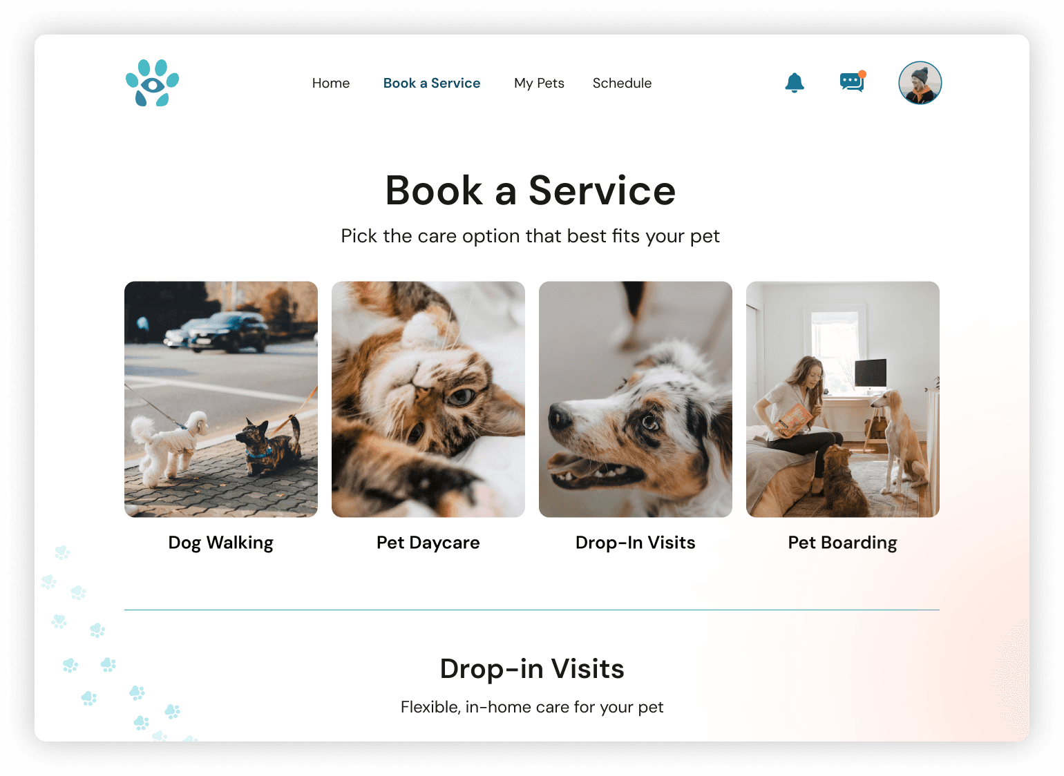
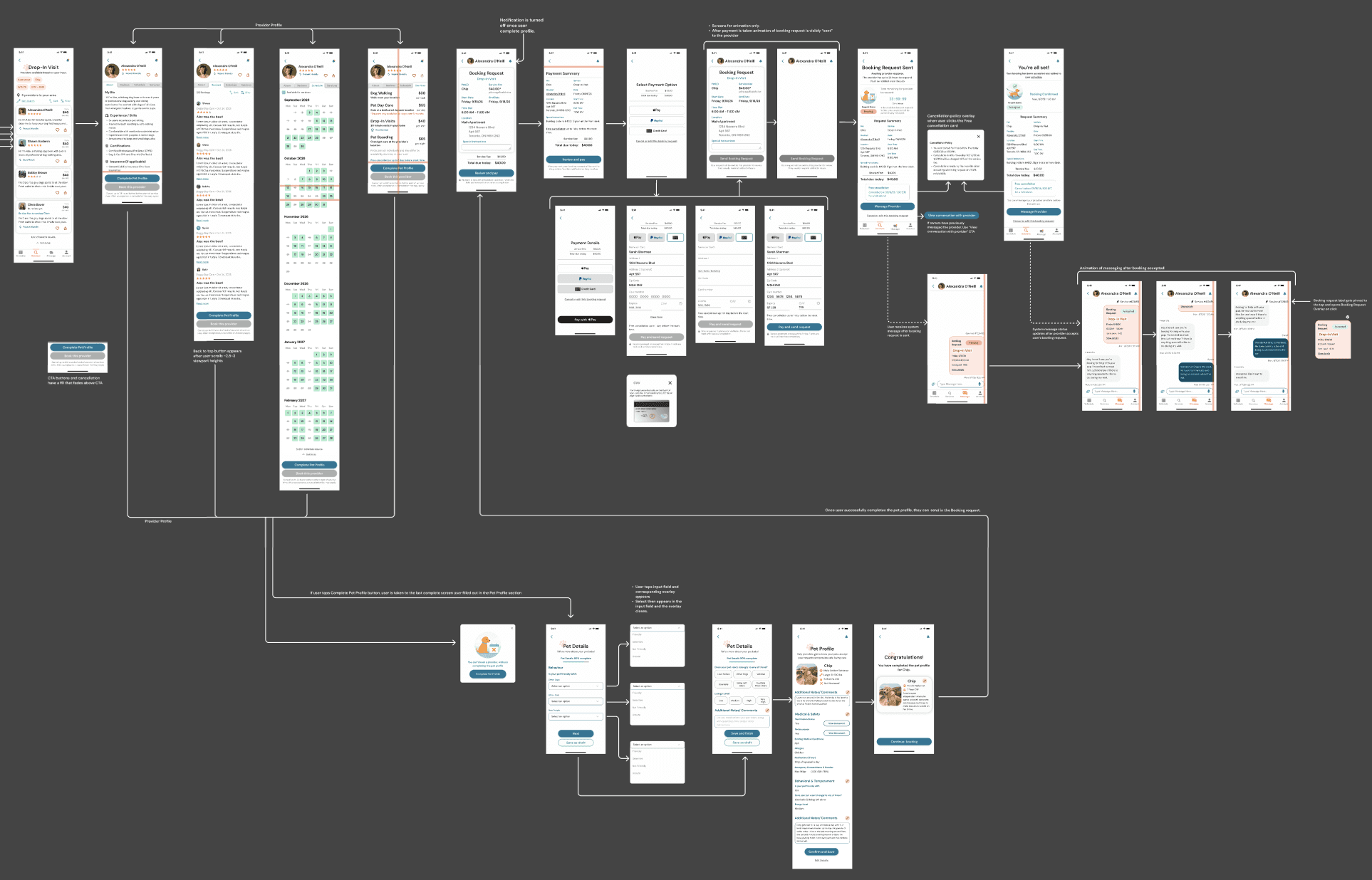
I translated the evolving structure into detailed UI and interactive prototypes, creating 50+ connected screens and overlays covering:
Onboarding
User account dashboard
Guided profile set up
Completion feedback

Booking
Single vs multi-day booking
Multiple visits per day
Time window logic
Payment method variations
Required profile validation before booking
Acceptance and rejection states
Recovery paths
Selecting a new provider after rejection
Ratings and review feedback loop

Validate
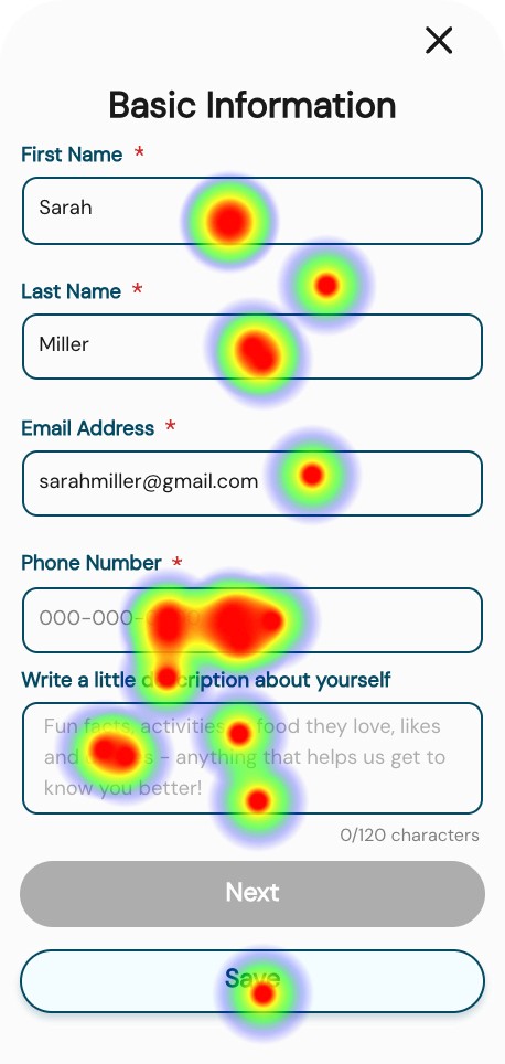
To evaluate the booking flow, payment clarity, cancellation understanding, profile requirements, and review submission, I conducted moderated usability testing across four task scenarios.
USABILITY TESTING
Total participants:
13 participants tested profile creation
4 participants tested payment and cancellation clarity
7 participants tested booking with incomplete profile
8 participants tested the review flow
Key findings:
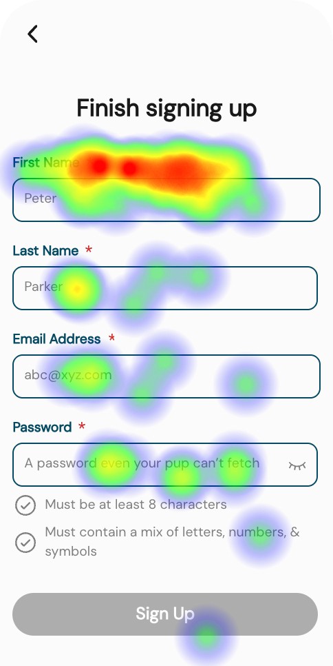
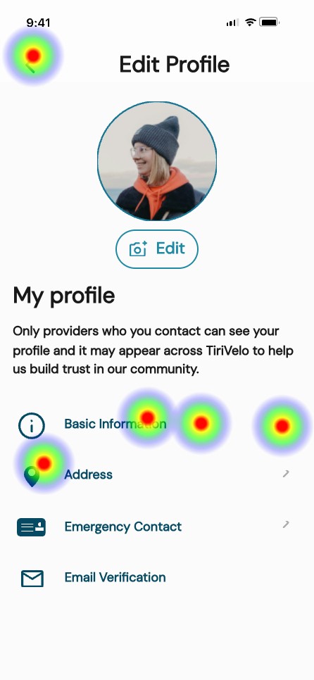
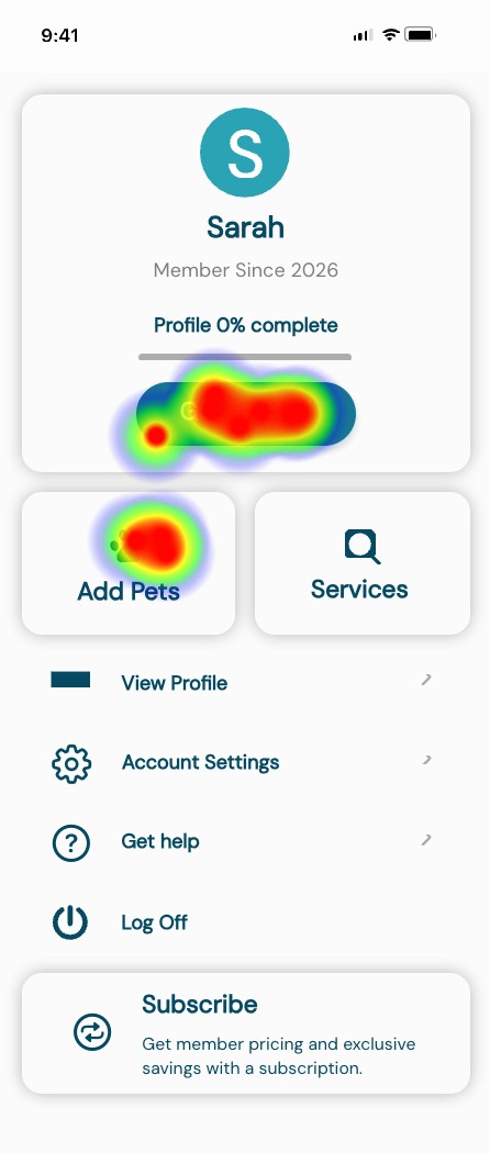
Profile creation
The onboarding flow performs at a neutral-to-positive baseline. It meets time expectations for most users and is perceived as moderately easy, though not effortless. The data suggests the experience is functional but leaves room for simplification or clarity improvements.


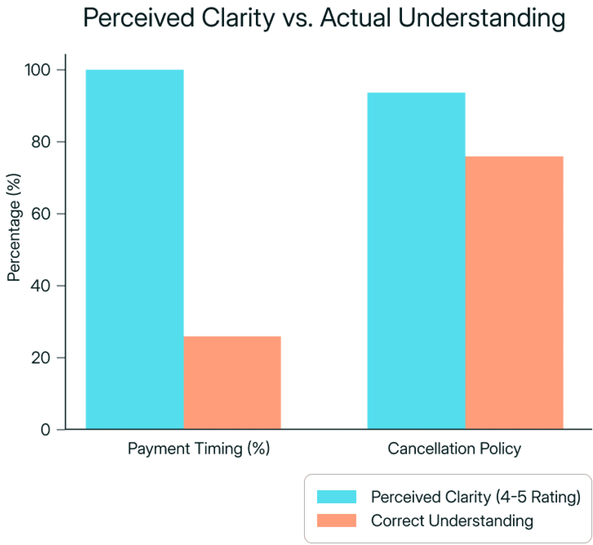
Policy Confidence vs. Comprehension
While participants reported high clarity for both payment timing and cancellation policies, only 25% correctly understood when funds are released, compared to 75% correctly understanding cancellation timing. This highlights how perceived clarity does not always reflect accurate mental models.

Booking with incomplete profile
Results were directionally useful but not conclusive due to limited participant volume. Additional testing was required to validate the booking flow under broader conditions.

Review flow
All 8 participants completed the review task, but several hesitated on the entry screen and were unclear whether their submission had successfully registered.
users spent an average of 19.21s
users spent an average of 4.86s

users spent an average of 13.45s

users spent an average of 13.45s
Conclusion
While directional insights were valuable, the booking flow required a follow-up round of testing with a larger sample to validate findings under stable interaction conditions.
USABILITY gaps
Testing surfaced three primary usability gaps:
Mental Model Mismatch
Users believed they understood payment and cancellation terms, yet misinterpreted release timing. This creates risk of surprise charges and reduced trust.
Design Response
Recommend to clarify payment timing using simpler language
Recommend to reframed cancellation as a benefit rather than fine print
Interaction clarity
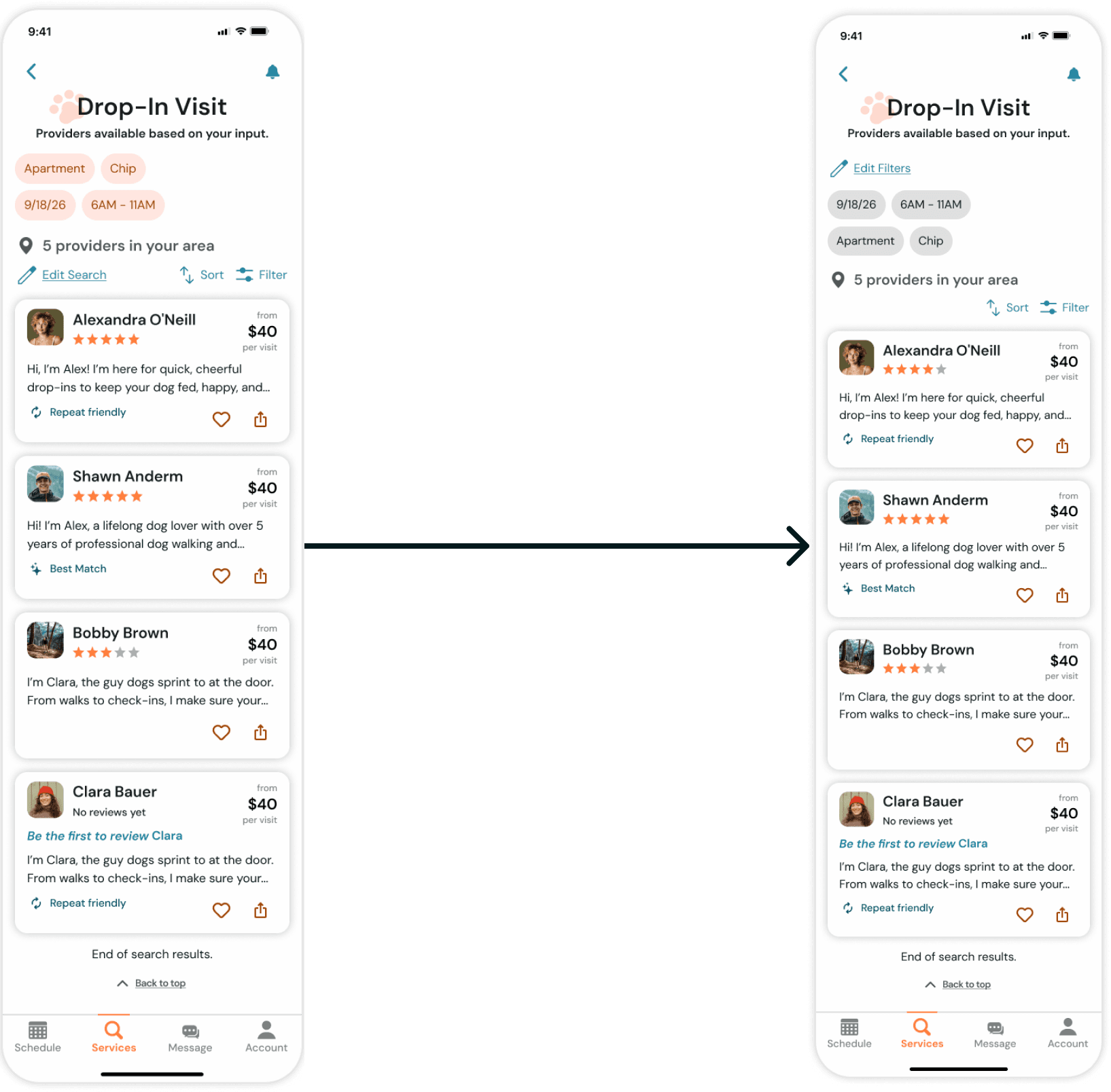
Some UI elements visually suggested interactivity when they were static, and system feedback was not always explicit.
Design Response
Adjusted visual treatment of filter chips
Strengthened hierarchy and tap affordances
Review discoverability and confirmation
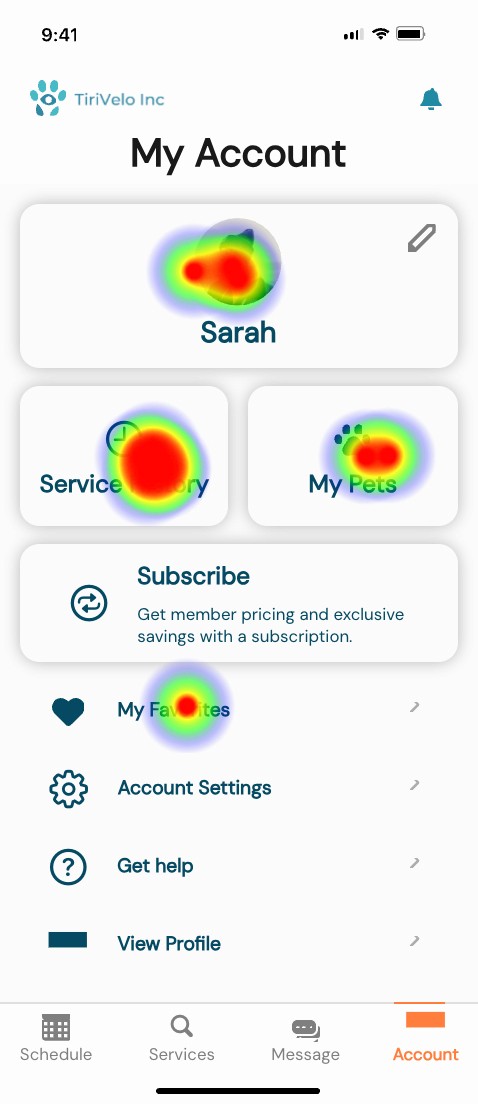
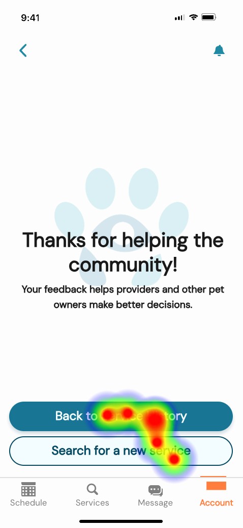
The review entry point was not immediately distinguishable within Service History, requiring additional exploration to locate. Additionally, the post-submission state did not provide strong enough confirmation to clearly signal task completion.
Design Response
Introduce a clearer visual indicator for pending reviews
Strengthen explicit success feedback after submission
1
1
2
2
Booking flow validation
Because early booking tests were limited in participant volume and affected by prototype constraints, the data did not fully validate flow efficiency.
Design Response
Recommended a second round of usability testing with expanded sample size
Reflection
What worked
Establishing a mobile design system early
Translating evolving business rules into UI logic
Closing the request lifecycle loop
Challenges I faced
Policies defined mid-project
Parallel team dependency
Rapid iteration under time pressure
What I learned
Design systems create stability during ambiguity.
Language shapes commitment.
Lifecycle states are critical in marketplaces.
Impact
The product moved from a conceptual booking demo to a launch-ready transactional system capable of supporting real scheduling and clear operational expectations.
See the complete flow below or play the prototype yourself.
A marketplace connecting pet owners with service providers.
duration
4 weeks
tools
Figma / ChatGPT / Pen & Paper / Maze
my role
Served as team lead while owning the booking foundation for a marketplace app.
overview
TiriVelo is a two-sided marketplace for booking pet care services.
A desktop platform had been designed but had not yet launched. The mobile initiative was an opportunity to translate the experience while also strengthening areas that would affect trust, clarity, and booking success.
Our team owned the pet owner side of the marketplace while a parallel team designed the provider experience. Because booking logic touches both sides, coordination and clear system thinking were critical.
Problem Statement
Urban pet owners struggle to confidently book care through new digital marketplaces.
Booking services for something as personal as pet care introduces anxiety around trust, cost transparency, and what happens after a request is submitted. When these concerns are not clearly addressed, users hesitate or abandon the process.
project scope
Two design teams worked in parallel across the pet owner experience.
My primary ownership:
End-to-end booking architecture
Payment flow
Request lifecycle states
Status visibility
Booking validation logic
Post-service feedback flow to close the booking loop
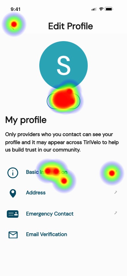
In addition, I co-designed the Owner Onboarding flow to ensure the booking journey could be tested holistically.
Evaluate
Understand what exists and where the risk lives.
Research
I reviewed available research artifacts and prior discovery work to understand user expectations, trust requirements, and common anxieties in booking care for pets. The material reinforced the importance of transparency around cost, clear service definitions, and confidence in what happens after a request is sent.
Competitors
I analyzed comparable marketplace apps to understand how mature products guide users from exploration to commitment. Across the board, successful platforms reduced ambiguity by clarifying pricing early, setting policy expectations before checkout, and maintaining strong visibility into request status.
flow audit
I evaluated the existing desktop foundation to determine how well it would translate to mobile behavior. While it offered a useful starting point, several risks emerged for first time users.
3
1
2
4
5
7
6
Key risks identified.
commitment language appeared before trust was built
service terminology required interpretation
scheduling assumed only a single visit
prices were not visible during decision making
payment and cancellation expectations were undefined
no flows built for incomplete profiles
booking outcomes were unclear
no built in feedback loop
Align
Booking touched both sides of the marketplace, and many of the operational rules were still emerging during the engagement. My role was to absorb new decisions, translate them into the owner experience, and keep the system coherent as definitions evolved.
I worked across teams to align on:
the mobile design system
how availability structures translate into user choices
visit capacity across a single day
request acceptance states
request denial and recovery paths
requirements for a valid transaction
Cross team syncronnization
At the start of the engagement, I established the mobile design system by adapting and extending the desktop foundation for small screens. I expanded typography, defined component behaviors, and built reusable interaction patterns that could scale across the product.
As our system matured, it became the working reference for consistency across the marketplace.
The provider designers adopted these standards to maintain consistency in UI structure, states, and lifecycle communication, which accelerated collaboration and reduced rework.
One key shift involved reframing primary actions. The original language emphasized “Book,” which assumed readiness to commit. For a new marketplace still earning trust, I introduced exploration based wording such as “Search” and “Select a service.” This vocabulary aligned the experience around discovery first, commitment second, and helped create consistency across both sides of the platform.
Operational Alignment
Research across teams showed providers work more effectively in predictable blocks rather than minute by minute appointments. After reviewing this insight, leadership shifted the marketplace from exact times to morning, afternoon, and evening windows.
That decision had significant downstream impact on how visits are configured. To support it, I designed a flexible calendar system that could represent single days, date ranges, multiple visits per day, and validation across time windows. The pattern created a shared structure that worked for both owner booking and provider availability.
In parallel, payment processing expectations, timing, and cancellation consequences were clarified and had not existed in the original desktop foundation. I translated these evolving rules into the journey through updated selection patterns, labels, and constraints so the interface matched real service operations while helping owners understand commitments before submitting a request.
Architect
With the operating direction established, I defined how the booking system should behave in response to user input. My goal was to make complexity manageable, prevent failure states, and ensure continuity after a request was sent.
Interaction logic
I created responsive patterns that adapt as selections change. The flow expands or simplifies depending on visit frequency, number of days, and time windows, revealing only what is necessary at each step.
INTEGRETY RULES
Using an incomplete Pet Profile completion as an example, I established conditions that must be met before submission. Users could not proceed without complete time assignments, required pet details, or compatible configurations. When something was missing, the system provided immediate feedback and a clear path to resolution.
lifecycle behavior
I defined how the experience continues after the request is placed, including pending states, confirmations, unsuccessful outcomes, and recommended alternatives. This ensured users always understood status and next steps.
After service completion, I introduced prompts that allow owners to provide feedback, extending the lifecycle into reputation building.
Design
Design work began early as a way to expose gaps, test assumptions, and make abstract requirements tangible.
As new operational rules and stakeholder direction emerged, I refined the experience to maintain clarity, usability, and system integrity.
core flows
I mapped the primary journeys from service selection through request outcomes, using them as working tools to reveal missing states and decision points.
wireframes
I moved into wireframing quickly to translate concepts into structure. Working in low fidelity allowed me to organize information, establish hierarchy, and understand how the experience should unfold across screens. By making the product visible, I could identify where additional logic, messaging, or constraints were necessary.
High fidelity Screens
I translated the evolving structure into detailed UI and interactive prototypes, creating 50+ connected screens and overlays covering:
Onboarding
User account dashboard
Guided profile set up
Completion feedback
Booking
Single vs multi-day booking
Multiple visits per day
Time window logic
Payment method variations
Required profile validation before booking
Acceptance and rejection states
Recovery paths
Selecting a new provider after rejection
Ratings and review feedback loop
Validate
To evaluate the booking flow, payment clarity, cancellation understanding, profile requirements, and review submission, I conducted moderated usability testing across four task scenarios.
USABILITY TESTING
Total participants:
13 participants tested profile creation
4 participants tested payment and cancellation clarity
7 participants tested booking with incomplete profile
8 participants tested the review flow
Key findings:
Profile creation
The onboarding flow performs at a neutral-to-positive baseline. It meets time expectations for most users and is perceived as moderately easy, though not effortless. The data suggests the experience is functional but leaves room for simplification or clarity improvements.
Policy Confidence vs. Comprehension
While participants reported high clarity for both payment timing and cancellation policies, only 25% correctly understood when funds are released, compared to 75% correctly understanding cancellation timing. This highlights how perceived clarity does not always reflect accurate mental models.
Booking with incomplete profile
Results were directionally useful but not conclusive due to limited participant volume. Additional testing was required to validate the booking flow under broader conditions.
Review flow
All 8 participants completed the review task, but several hesitated on the entry screen and were unclear whether their submission had successfully registered.
users spent an average of 19.21s
users spent an average of 4.86s
users spent an average of 13.45s
users spent an average of 13.45s
Conclusion
While directional insights were valuable, the booking flow required a follow-up round of testing with a larger sample to validate findings under stable interaction conditions.
USABILITY gaps
Testing surfaced three primary usability gaps:
Mental Model Mismatch
Users believed they understood payment and cancellation terms, yet misinterpreted release timing. This creates risk of surprise charges and reduced trust.
Design Response
Recommend to clarify payment timing using simpler language
Recommend to reframed cancellation as a benefit rather than fine print
Interaction clarity
Some UI elements visually suggested interactivity when they were static, and system feedback was not always explicit.
Design Response
Adjusted visual treatment of filter chips
Strengthened hierarchy and tap affordances
Review discoverability and confirmation
The review entry point was not immediately distinguishable within Service History, requiring additional exploration to locate. Additionally, the post-submission state did not provide strong enough confirmation to clearly signal task completion.
Design Response
Introduce a clearer visual indicator for pending reviews
Strengthen explicit success feedback after submission
1
1
2
2
Booking flow validation
Because early booking tests were limited in participant volume and affected by prototype constraints, the data did not fully validate flow efficiency.
Design Response
Recommended a second round of usability testing with expanded sample size
Reflection
What worked
Establishing a mobile design system early
Translating evolving business rules into UI logic
Closing the request lifecycle loop
Challenges I faced
Policies defined mid-project
Parallel team dependency
Rapid iteration under time pressure
What I learned
Design systems create stability during ambiguity.
Language shapes commitment.
Lifecycle states are critical in marketplaces.
Impact
The product moved from a conceptual booking demo to a launch-ready transactional system capable of supporting real scheduling and clear operational expectations.
See the complete flow below or play the prototype yourself.
A marketplace connecting pet owners with service providers.
duration
4 weeks
tools
Figma / ChatGPT / Pen & Paper / Maze
my role
Served as team lead while owning the booking foundation for a marketplace app.
overview
TiriVelo is a two-sided marketplace for booking pet care services.
A desktop platform had been designed but had not yet launched. The mobile initiative was an opportunity to translate the experience while also strengthening areas that would affect trust, clarity, and booking success.
Our team owned the pet owner side of the marketplace while a parallel team designed the provider experience. Because booking logic touches both sides, coordination and clear system thinking were critical.
Problem Statement
Urban pet owners struggle to confidently book care through new digital marketplaces.
Booking services for something as personal as pet care introduces anxiety around trust, cost transparency, and what happens after a request is submitted. When these concerns are not clearly addressed, users hesitate or abandon the process.
project scope
Two design teams worked in parallel across the pet owner experience.
My primary ownership:
End-to-end booking architecture
Payment flow
Request lifecycle states
Status visibility
Booking validation logic
Post-service feedback flow to close the booking loop
In addition, I co-designed the Owner Onboarding flow to ensure the booking journey could be tested holistically.
Evaluate
Understand what exists and where the risk lives.
Research
I reviewed available research artifacts and prior discovery work to understand user expectations, trust requirements, and common anxieties in booking care for pets. The material reinforced the importance of transparency around cost, clear service definitions, and confidence in what happens after a request is sent.
Competitors
I analyzed comparable marketplace apps to understand how mature products guide users from exploration to commitment. Across the board, successful platforms reduced ambiguity by clarifying pricing early, setting policy expectations before checkout, and maintaining strong visibility into request status.
flow audit
I evaluated the existing desktop foundation to determine how well it would translate to mobile behavior. While it offered a useful starting point, several risks emerged for first time users.
3
1
2
4
5
7
6
Key risks identified.
commitment language appeared before trust was built
service terminology required interpretation
scheduling assumed only a single visit
prices were not visible during decision making
payment and cancellation expectations were undefined
no flows built for incomplete profiles
booking outcomes were unclear
no built in feedback loop
Align
Booking touched both sides of the marketplace, and many of the operational rules were still emerging during the engagement. My role was to absorb new decisions, translate them into the owner experience, and keep the system coherent as definitions evolved.
I worked across teams to align on:
the mobile design system
how availability structures translate into user choices
visit capacity across a single day
request acceptance states
request denial and recovery paths
requirements for a valid transaction
Cross team syncronnization
At the start of the engagement, I established the mobile design system by adapting and extending the desktop foundation for small screens. I expanded typography, defined component behaviors, and built reusable interaction patterns that could scale across the product.
As our system matured, it became the working reference for consistency across the marketplace.
The provider designers adopted these standards to maintain consistency in UI structure, states, and lifecycle communication, which accelerated collaboration and reduced rework.
One key shift involved reframing primary actions. The original language emphasized “Book,” which assumed readiness to commit. For a new marketplace still earning trust, I introduced exploration based wording such as “Search” and “Select a service.” This vocabulary aligned the experience around discovery first, commitment second, and helped create consistency across both sides of the platform.
Operational Alignment
Research across teams showed providers work more effectively in predictable blocks rather than minute by minute appointments. After reviewing this insight, leadership shifted the marketplace from exact times to morning, afternoon, and evening windows.
That decision had significant downstream impact on how visits are configured. To support it, I designed a flexible calendar system that could represent single days, date ranges, multiple visits per day, and validation across time windows. The pattern created a shared structure that worked for both owner booking and provider availability.
In parallel, payment processing expectations, timing, and cancellation consequences were clarified and had not existed in the original desktop foundation. I translated these evolving rules into the journey through updated selection patterns, labels, and constraints so the interface matched real service operations while helping owners understand commitments before submitting a request.
Architect
With the operating direction established, I defined how the booking system should behave in response to user input. My goal was to make complexity manageable, prevent failure states, and ensure continuity after a request was sent.
Interaction logic
I created responsive patterns that adapt as selections change. The flow expands or simplifies depending on visit frequency, number of days, and time windows, revealing only what is necessary at each step.
INTEGRETY RULES
Using an incomplete Pet Profile completion as an example, I established conditions that must be met before submission. Users could not proceed without complete time assignments, required pet details, or compatible configurations. When something was missing, the system provided immediate feedback and a clear path to resolution.
lifecycle behavior
I defined how the experience continues after the request is placed, including pending states, confirmations, unsuccessful outcomes, and recommended alternatives. This ensured users always understood status and next steps.
After service completion, I introduced prompts that allow owners to provide feedback, extending the lifecycle into reputation building.
Design
Design work began early as a way to expose gaps, test assumptions, and make abstract requirements tangible.
As new operational rules and stakeholder direction emerged, I refined the experience to maintain clarity, usability, and system integrity.
core flows
I mapped the primary journeys from service selection through request outcomes, using them as working tools to reveal missing states and decision points.
wireframes
I moved into wireframing quickly to translate concepts into structure. Working in low fidelity allowed me to organize information, establish hierarchy, and understand how the experience should unfold across screens. By making the product visible, I could identify where additional logic, messaging, or constraints were necessary.
High fidelity Screens
I translated the evolving structure into detailed UI and interactive prototypes, creating 50+ connected screens and overlays covering:
Onboarding
User account dashboard
Guided profile set up
Completion feedback
Booking
Single vs multi-day booking
Multiple visits per day
Time window logic
Payment method variations
Required profile validation before booking
Acceptance and rejection states
Recovery paths
Selecting a new provider after rejection
Ratings and review feedback loop
Validate
To evaluate the booking flow, payment clarity, cancellation understanding, profile requirements, and review submission, I conducted moderated usability testing across four task scenarios.
USABILITY TESTING
Total participants:
13 participants tested profile creation
4 participants tested payment and cancellation clarity
7 participants tested booking with incomplete profile
8 participants tested the review flow
Key findings:
Profile creation
The onboarding flow performs at a neutral-to-positive baseline. It meets time expectations for most users and is perceived as moderately easy, though not effortless. The data suggests the experience is functional but leaves room for simplification or clarity improvements.
Policy Confidence vs. Comprehension
While participants reported high clarity for both payment timing and cancellation policies, only 25% correctly understood when funds are released, compared to 75% correctly understanding cancellation timing. This highlights how perceived clarity does not always reflect accurate mental models.
Booking with incomplete profile
Results were directionally useful but not conclusive due to limited participant volume. Additional testing was required to validate the booking flow under broader conditions.
Review flow
All 8 participants completed the review task, but several hesitated on the entry screen and were unclear whether their submission had successfully registered.
users spent an average of 19.21s
users spent an average of 4.86s
users spent an average of 13.45s
users spent an average of 13.45s
Conclusion
While directional insights were valuable, the booking flow required a follow-up round of testing with a larger sample to validate findings under stable interaction conditions.
USABILITY gaps
Testing surfaced three primary usability gaps:
Mental Model Mismatch
Users believed they understood payment and cancellation terms, yet misinterpreted release timing. This creates risk of surprise charges and reduced trust.
Design Response
Recommend to clarify payment timing using simpler language
Recommend to reframed cancellation as a benefit rather than fine print
Interaction clarity
Some UI elements visually suggested interactivity when they were static, and system feedback was not always explicit.
Design Response
Adjusted visual treatment of filter chips
Strengthened hierarchy and tap affordances
Review discoverability and confirmation
The review entry point was not immediately distinguishable within Service History, requiring additional exploration to locate. Additionally, the post-submission state did not provide strong enough confirmation to clearly signal task completion.
Design Response
Introduce a clearer visual indicator for pending reviews
Strengthen explicit success feedback after submission
1
1
2
2
Booking flow validation
Because early booking tests were limited in participant volume and affected by prototype constraints, the data did not fully validate flow efficiency.
Design Response
Recommended a second round of usability testing with expanded sample size
Reflection
What worked
Establishing a mobile design system early
Translating evolving business rules into UI logic
Closing the request lifecycle loop
Challenges I faced
Policies defined mid-project
Parallel team dependency
Rapid iteration under time pressure
What I learned
Design systems create stability during ambiguity.
Language shapes commitment.
Lifecycle states are critical in marketplaces.
Impact
The product moved from a conceptual booking demo to a launch-ready transactional system capable of supporting real scheduling and clear operational expectations.
See the complete flow below or play the prototype yourself.
A marketplace connecting pet owners with service providers.
duration
4 weeks
tools
Figma / ChatGPT / Pen & Paper / Maze
my role
Served as team lead while owning the booking foundation for a marketplace app.