savr
savr
5-day Design Sprint
Helping home cooks confidently follow new recipes.
duration
1 week
tools
Figma / DALL-E / Pen & Paper
my role
Solo student project for Springboard UX Bootcamp X Bitesize UX
savr
A smart activity discovery app for LA parents
savr
A smart activity discovery app for LA parents
duration
1 week
tools
Figma / DALL-E / Pen & Paper
my role
Solo student project for Springboard UX Bootcamp X Bitesize UX
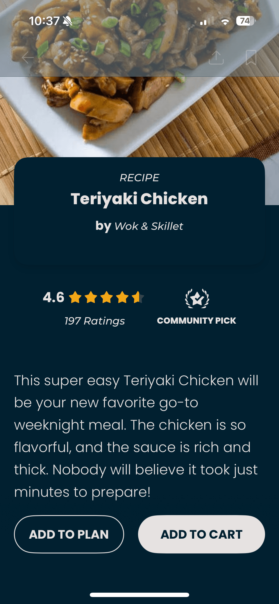
Savr is an new startup that shows hundreds of recipes, and cooking tips for at-home chefs. They have an active community of users who rate and review recipes for other users.
Savr is an new startup that shows hundreds of recipes, and cooking tips for at-home chefs. They have an active community of users who rate and review recipes for other users.
People often feel disappointed with a recipe outcome because the instructions are unclear or hard to execute. While Savr receives strong feedback on recipe quality, the challenge is helping users follow the cooking steps accurately and with ease.
index
Day 1
Understand
Understand
“It’s really confusing when they say “now add in the sugar, and the garlic, and the salt and pepper, and the minced vegetables,” when I could have had all of the that prepared ... at the beginning”
User - Maria
research
Research shows that users frequently do not know what to prepare before starting, how to stay on track during the process, or what the food should look like partway through. Switching between tasks and constantly referring back to a phone leads to overcooked ingredients, unnecessary cleanup, and abandoned recipes. The experience feels chaotic instead of enjoyable.
Clarity, timing guidance, and support that reduces guesswork
To know what to prep before actual cooking starts
Proactive alerts on what they can do during downtime
Simple explanations of cooking vocabulary
Visual confirmation that they are making progress correctly
problem
Home cooks struggle to confidently follow new recipes due to unclear steps, poor timing guidance, and unnecessary stress.
How might we help home cooks feel confident and prepared while following new recipes, without adding complexity or interruptions?
map

Day 2
Sketch
Sketch
lightning demos
To gain inspiration for my solution, I reviewed five apps that either directly support cooking or provide strong guidance for task-based activities.
To gain inspiration for my solution, I reviewed five apps that either directly support cooking or provide strong guidance for task-based activities.
I selected these apps because they use patterns that solve similar problems around timing, clarity, technique guidance, and user confidence.
Side Chef:
Side Chef:
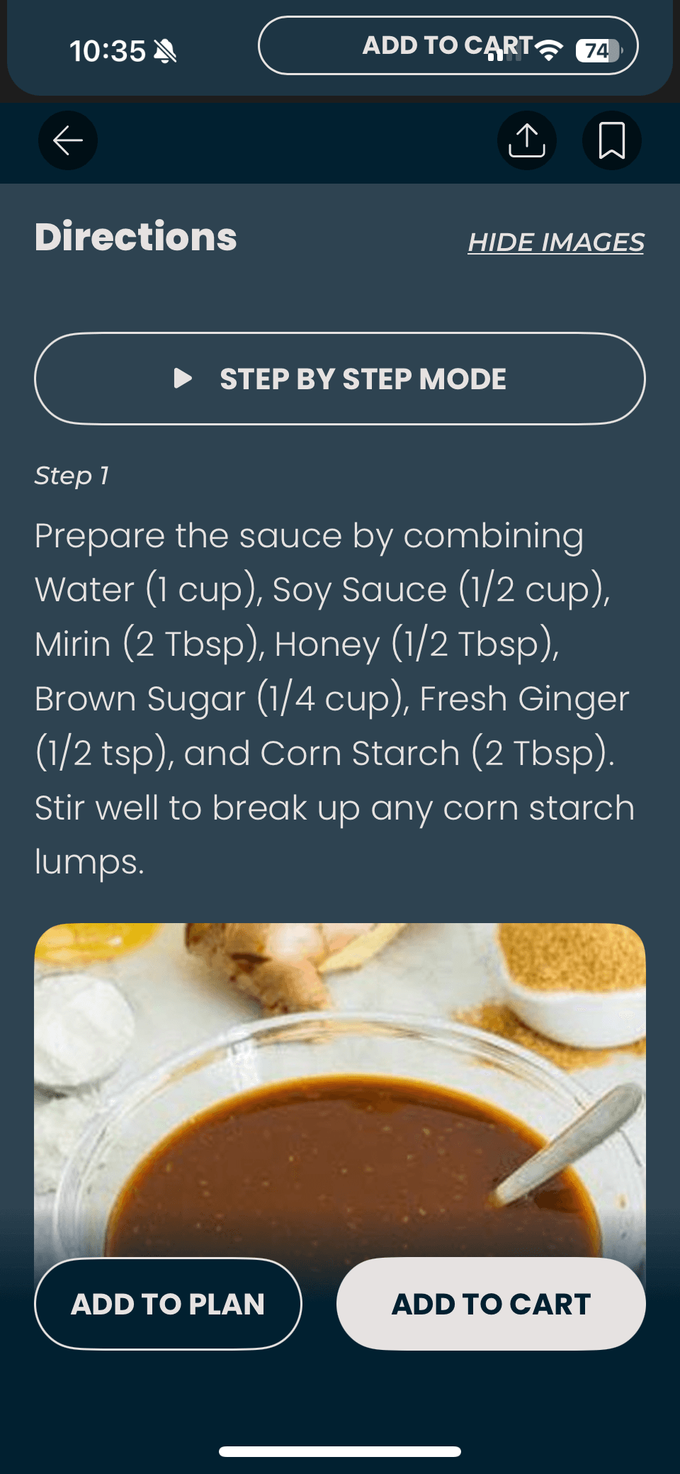
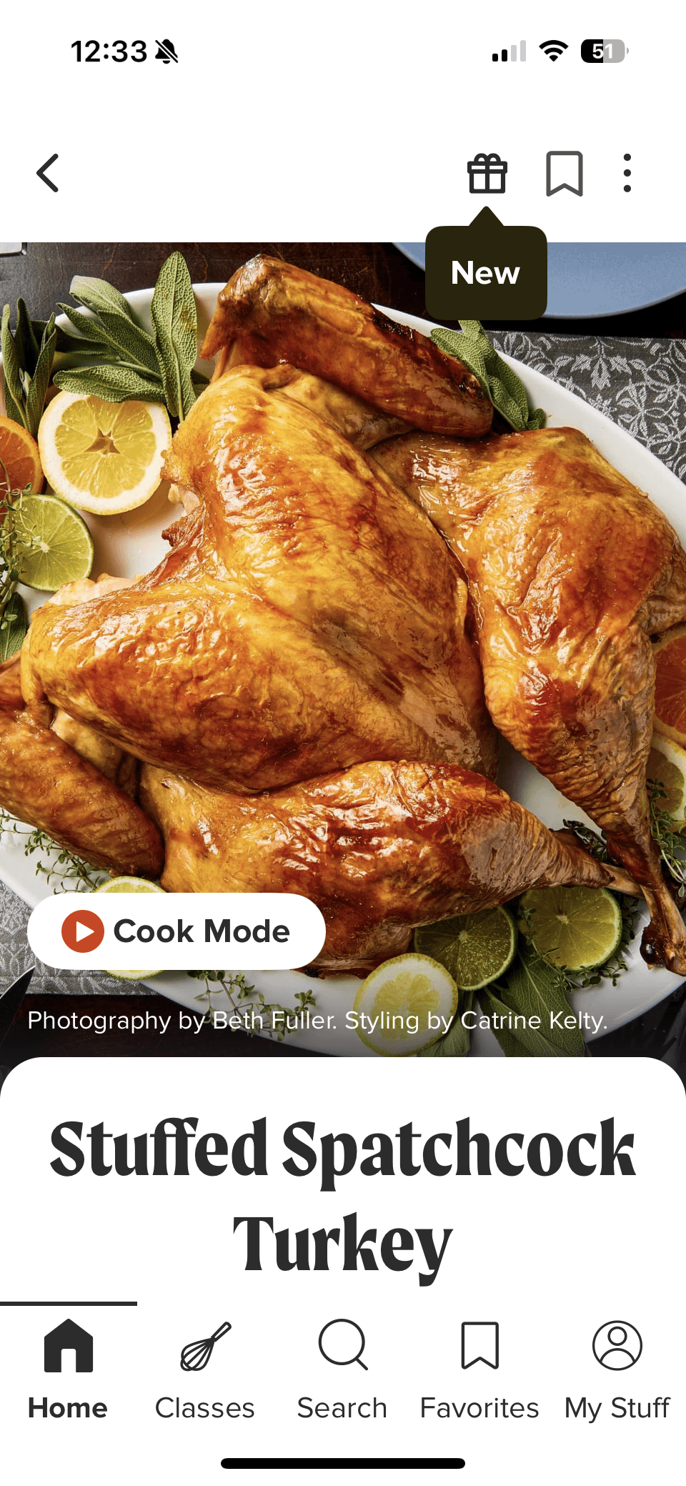
SideChef offers an interactive, Step By Step mode cooking experience with built-in timers and either looping videos or static images for each step. Some recipes also include links to full YouTube walkthroughs. The Cook Mode is highly guided, allowing users to swipe through steps while keeping key visuals and timing front and center.


Tasty:
Tasty:
Tasty provides a recipe overview that includes an ingredient list and community tips. Its Cook Mode uses short, looping videos for each instruction, with the ingredients needed for each step displayed at the start of the video. The full ingredient list remains accessible throughout cooking via a persistent top navigation tab, allowing users to reference it at any point.


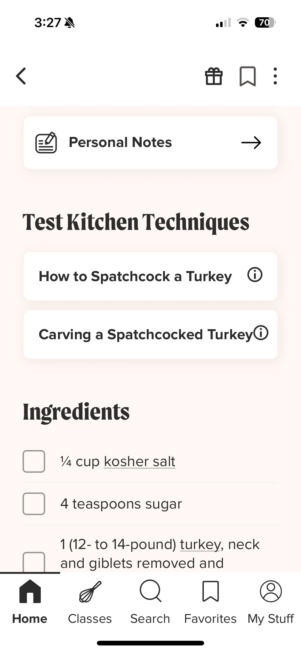
America’s Test Kitchen:
America’s Test Kitchen:
America’s Test Kitchen emphasizes education and technique alongside cooking. Recipes include links to instructional videos for specific techniques, as well as a detailed recipe and ingredient overview. Their Cook Mode is led by experienced chefs and features step-by-step video guidance that reinforces both execution and learning.


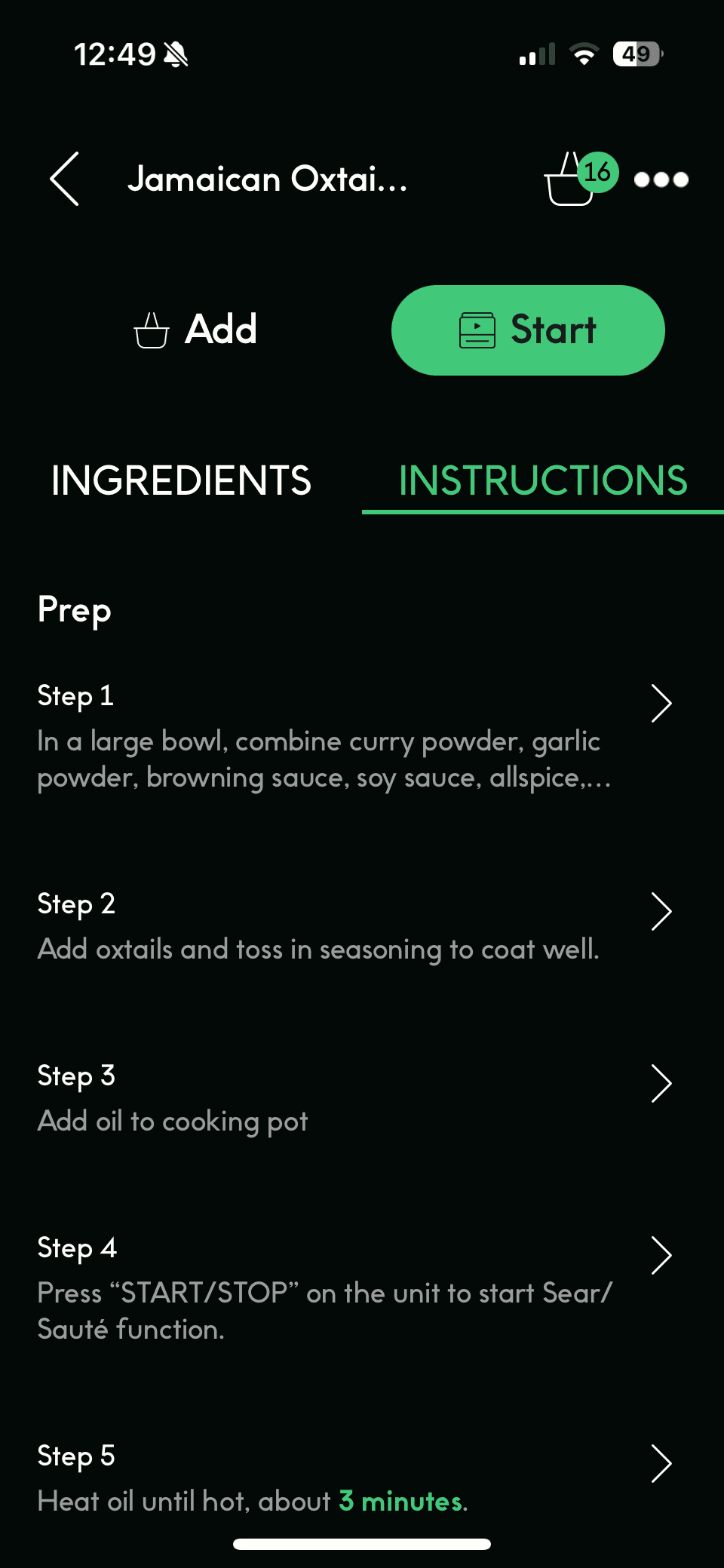
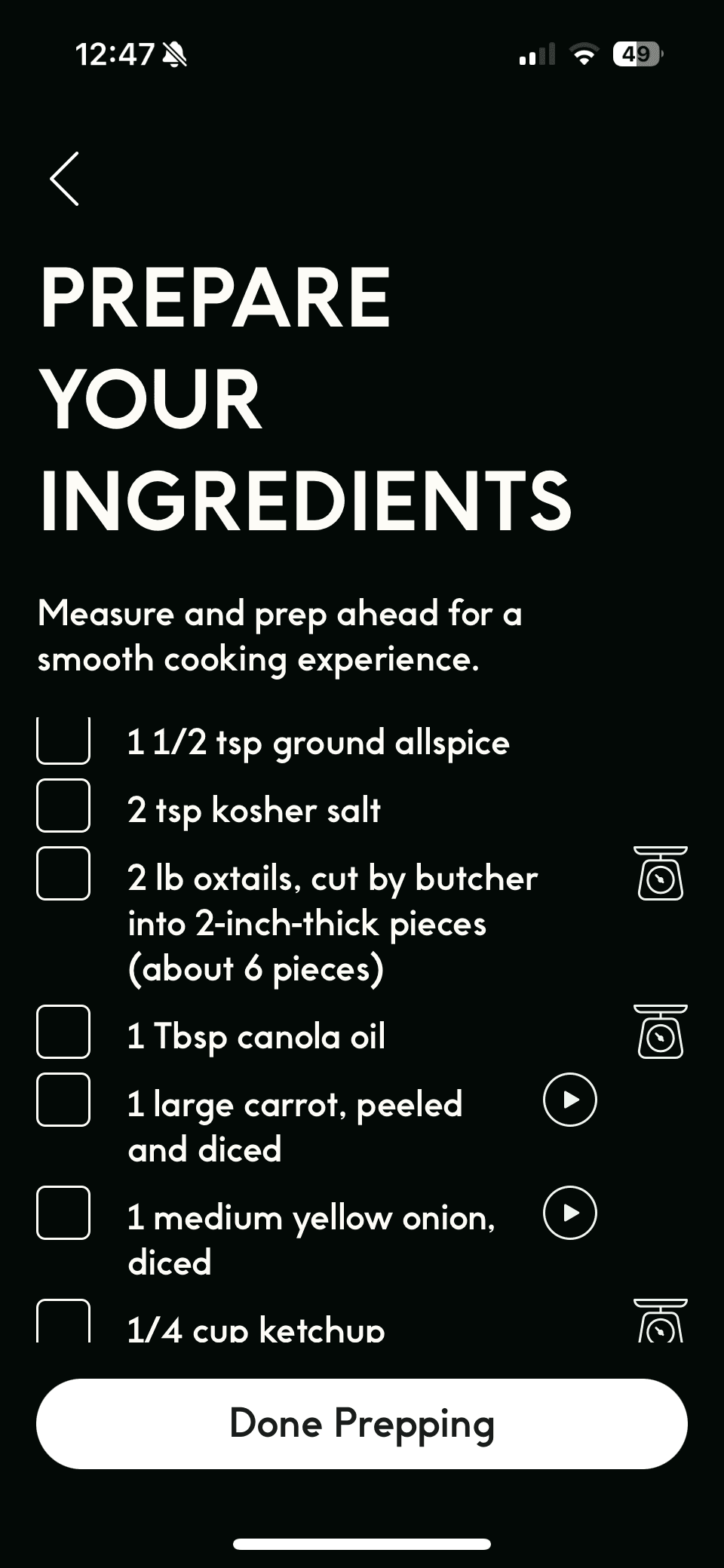
Chef iQ:
Chef iQ:
Chef iQ blends guided recipes with proprietary smart kitchen devices to help users cook with precision. From the recipe page, users can access quick technique tutorials or enter Guided Cooking mode for step-by-step instruction. The first step is a Prepare Your Ingredients screen featuring short videos that demonstrate essential prep skills like mincing and dicing.


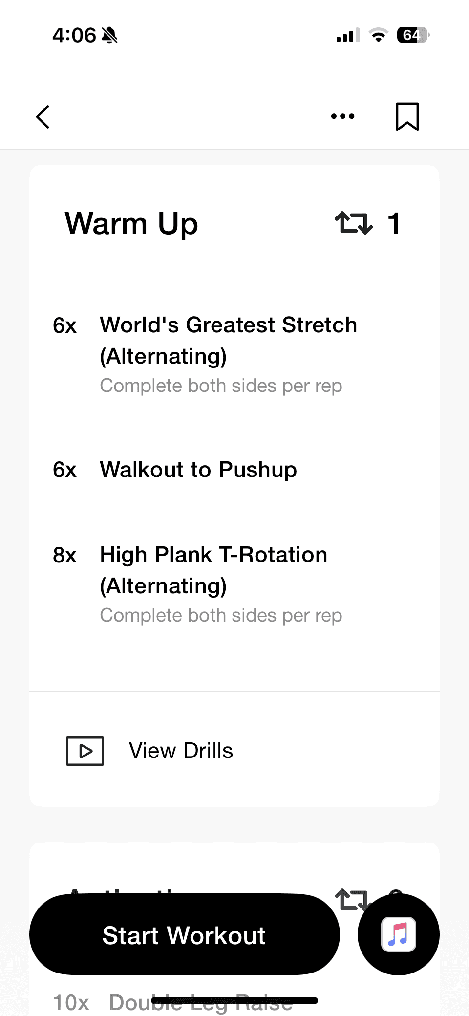
Nike Training Club:
Nike Training Club:
Nike Training Club is not a cooking app, but I chose it to explore how step-by-step instruction works in a completely different context. Each workout includes a clear overview of time, difficulty, workout type, equipment needed, and class format. Users can follow either instructor-led classes or self-guided “whiteboard” workouts with video demonstrations for each movement.


Key Takeaways:
Key Takeaways:
The strongest cooking and training experiences rely on step-by-step guidance, visual instruction, and built-in timing to reduce friction in execution. SideChef and Tasty reinforced the value of looping videos and persistent ingredient access, while America’s Test Kitchen emphasized technique education. Nike Training Club showed how surfacing required tools and clear structure before starting builds confidence. Together, these insights shaped Savr’s focus on prep-first design, visual checkpoints, and a distraction-free Cook Mode.
Crazy 8’s
After mapping the full cooking experience, I identified the most critical screen as the Guided Cooking Step Screen. This is where the primary action takes place and where user stress and confusion are highest.
After mapping the full cooking experience, I identified the most critical screen as the Guided Cooking Step Screen. This is where the primary action takes place and where user stress and confusion are highest.
I sketched eight quick variations of how this screen could work, exploring different combinations of:
Video and visual technique support
Prep-ahead suggestions
Progress and timing cues
Hands-free audio interaction
Ingredient visibility at the correct moment

solution sketch
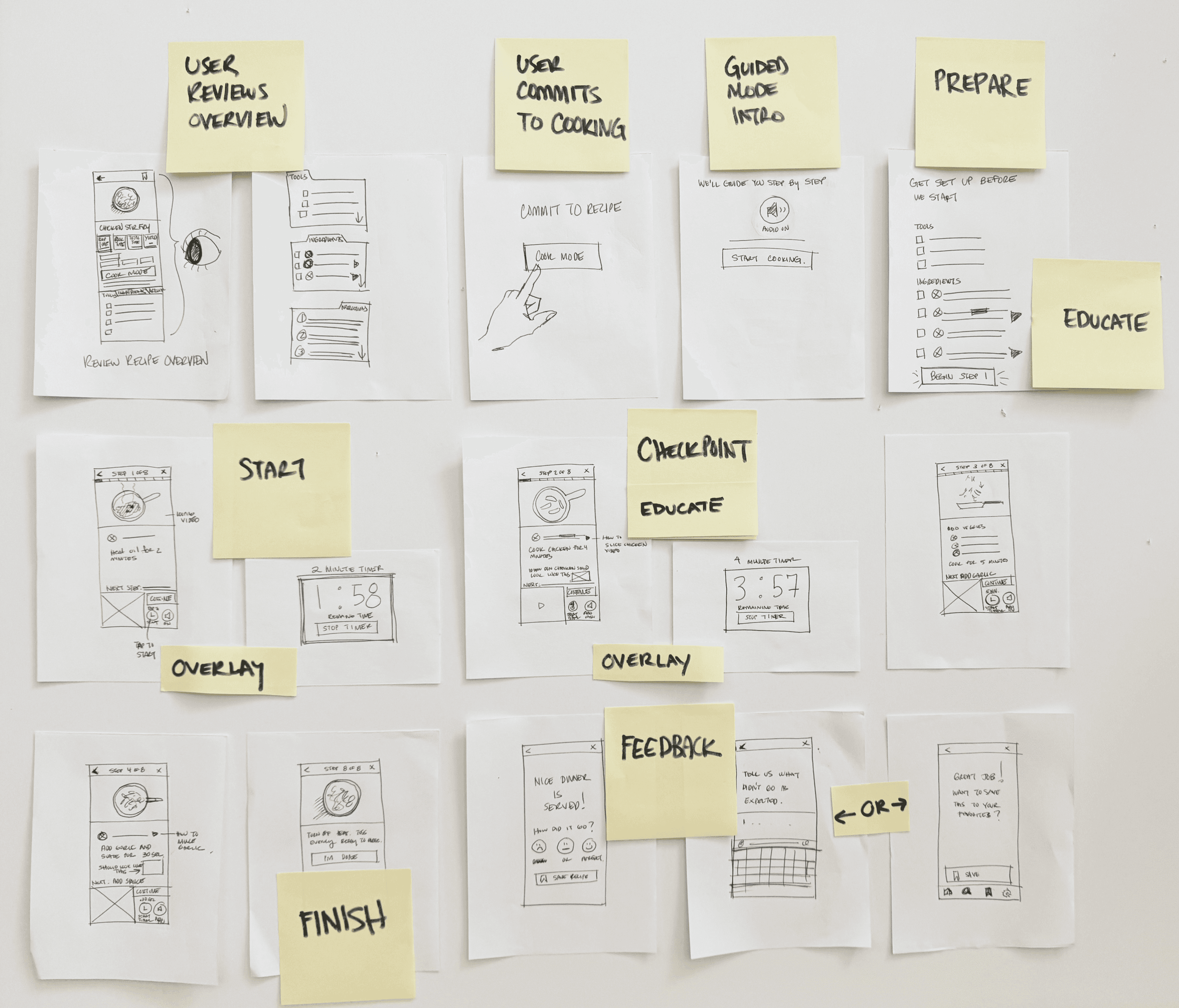
I selected the strongest Crazy 8s concept and developed a focused three panel storyboard showing the flow into my critical screen and what comes next.
I selected the strongest Crazy 8s concept and developed a focused three panel storyboard showing the flow into my critical screen and what comes next.

Before screen (left) Recipe overview with “Start Cooking” button to enter guided mode.
Critical screen (middle): Guided Step Screen
Step progress at the top
Looping video demonstrating the action
Ingredient list with optional technique micro videos
Instruction copy placed close to the visual
“While this cooks…” preview to anticipate the next step
Continue button plus timer (if applicable to the step) and audio controls for hands-free support
Next step screen (right)
The user advances with more clarity and pacing guidance.
Day 3
Decide
Decide
storyboard
I built the storyboard to show the key moments a user experiences when cooking with Savr’s guided mode.
I built the storyboard to show the key moments a user experiences when cooking with Savr’s guided mode.
1
1
2
2
3
3
4
4
5
5
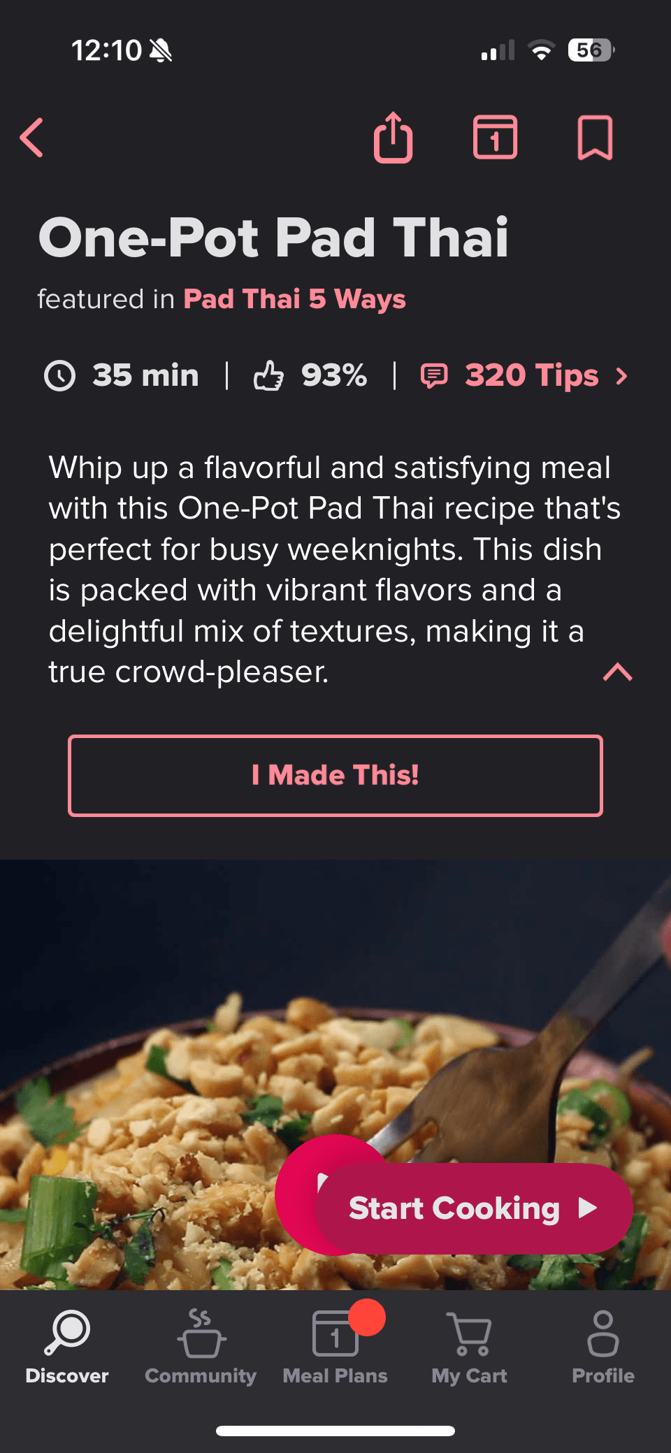
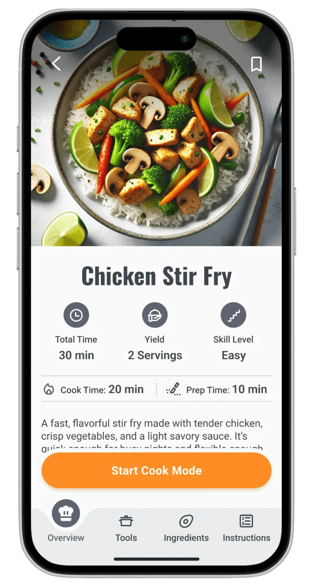
Recipe Overview: Users start on the recipe details screen to decide if they want to cook the dish.
Commit to Cook Mode: Once they commit, they enter guided cooking mode.
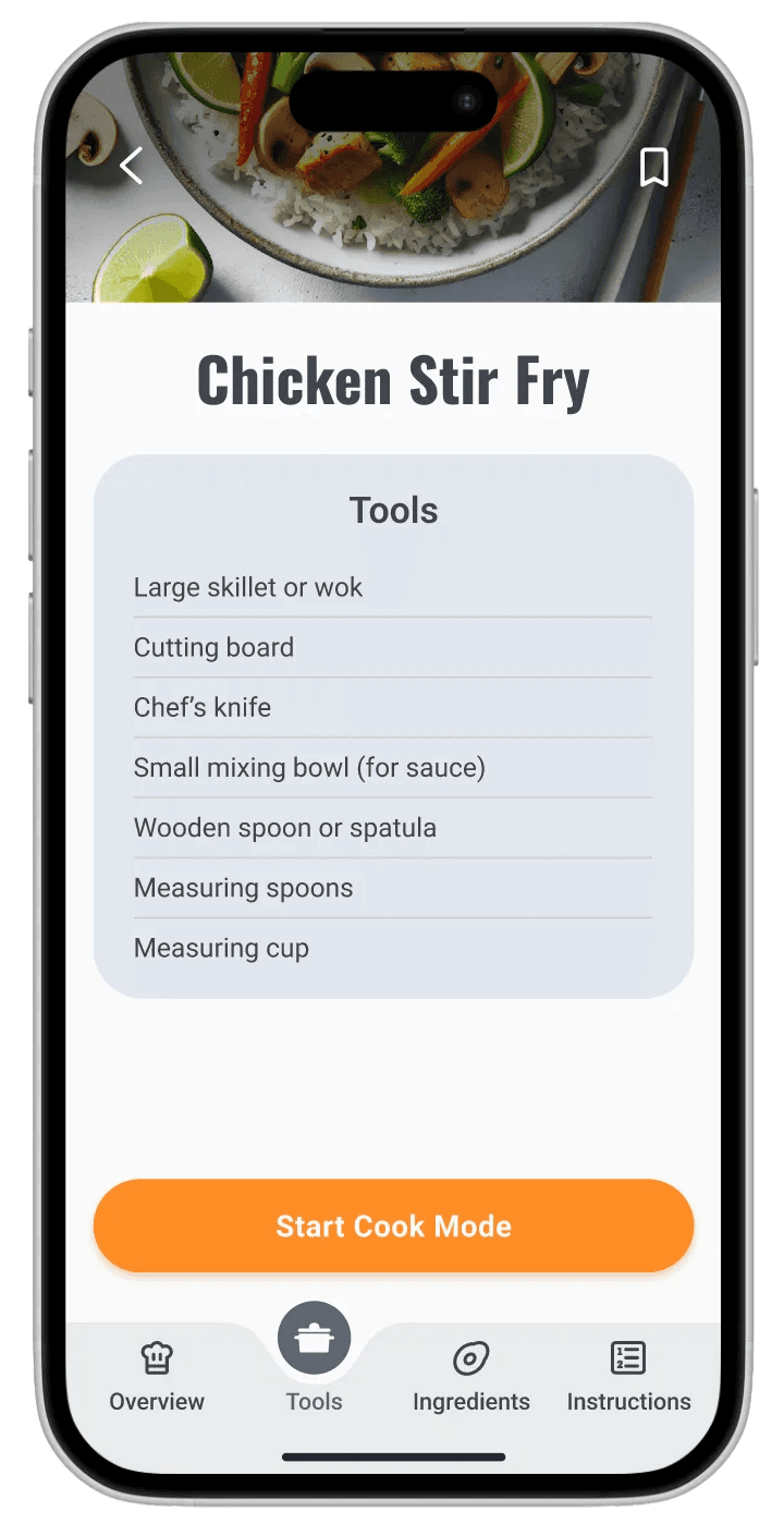
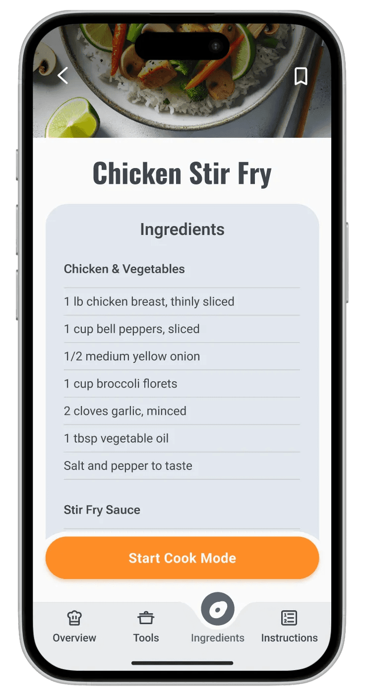
Prepare: A simple checklist helps users prep tools and ingredients before any cooking begins, with links to technique videos for added education.
Guided Steps: From start to finish, the critical cooking steps use clickable overlay timers, looping videos, clickable ingredient guidance, visual checkpoints to show what each step should look like, and prep-ahead cues.
Feedback and Support: The flow ends with a quick feedback screen where users can reflect on the experience and access AI guidance to help diagnose issues when things don’t go as expected.
Day 4
Prototype
Prototype
core flows
To keep the prototype focused and testable, I centered it around three core flows that represent the most critical moments of the experience:
User reviews recipe
User reviews recipe

User starts cooking
User starts cooking


User exchanges feedback
User exchanges feedback


features
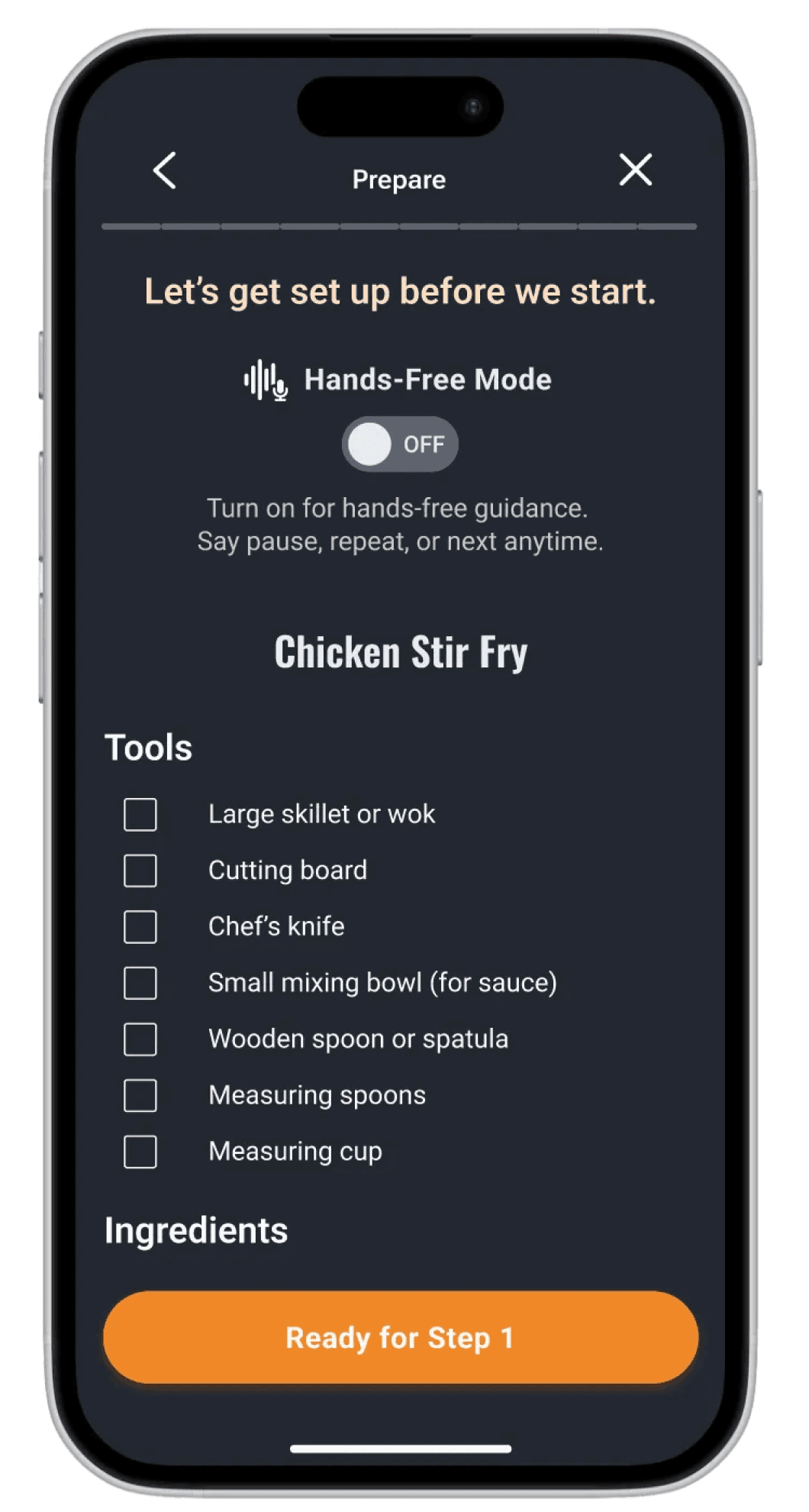
Prepare Screen
Prepare Screen
A pre-cook checklist that helps users gather tools and ingredients before any heat is involved. This reduces rushing, timing mistakes, and mid-cook stress.
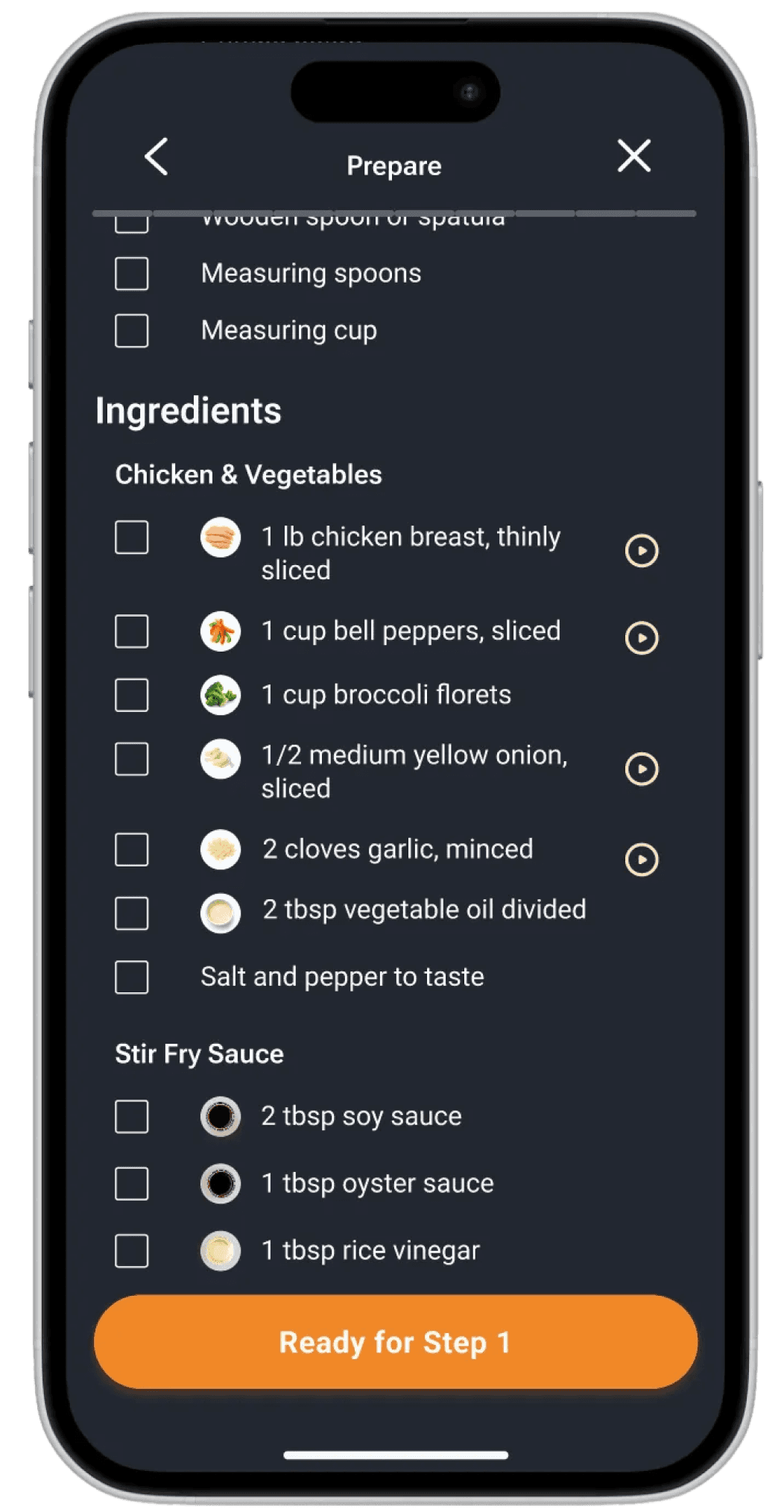
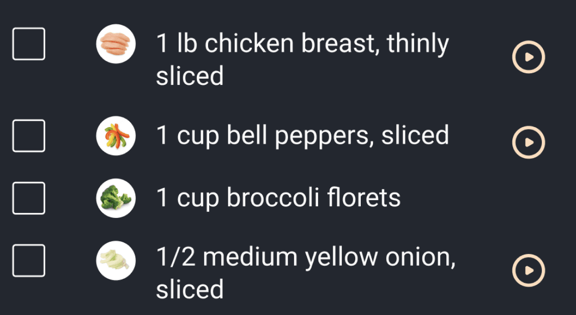
Ingredient and Technique Guidance
Ingredient and Technique Guidance
Clickable ingredient and technique callouts help explain cuts, prep methods, and unfamiliar terminology in context.

Step-by-Step Guided Cook Mode
Step-by-Step Guided Cook Mode
Each cooking step is presented individually to keep focus high and cognitive load low. Users move through the recipe in a controlled, predictable way.
Cook Mode Visual Checkpoints
Cook Mode Visual Checkpoints
Mid-step visuals show what the food should look like at that moment, helping users confirm they are on the right track.

Looping Instructional Videos
Looping Instructional Videos
Every critical step includes a short looping video so users can quickly understand what to do without scrubbing or replaying long clips.
Next Step Preview
Next Step Preview
A forward-looking preview shows what’s coming up next so users can mentally prepare and multitask more effectively.

Inline Timers
Inline Timers
Timers are embedded directly into relevant steps so users don’t have to mentally track time or leave the screen.

Hands-Free Mode
Hands-Free Mode
A voice-guided option designed to allow users to pause, repeat, or move forward without touching the screen during active cooking.

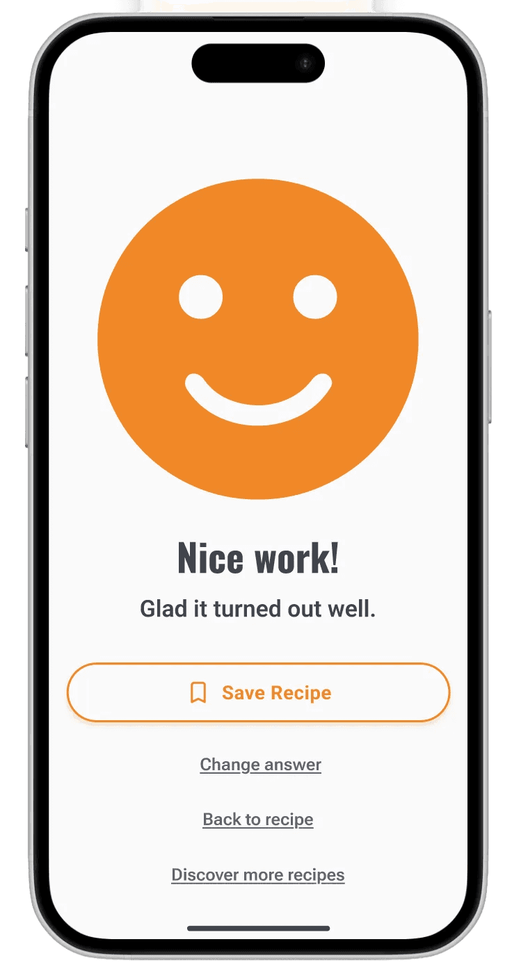
Feedback and AI-Guided Support
Feedback and AI-Guided Support
After cooking, users reflect on how the experience went. If something went wrong, an AI-guided troubleshooting path helps diagnose what may have caused the issue.

Day 5
Test
Test
Interviews
I tested the prototype with five home cooks who cook between two and four or more times per week.
I tested the prototype with five home cooks who cook between two and four or more times per week.
Experience levels ranged from beginner to confident, and most rely on recipe websites rather than cooking apps. Common frustrations included scrolling through long recipes, unclear timing, portion conversion, and cluttered content. Participants explored the prototype naturally by reviewing ingredients and tools, moving through Cook Mode, and completing the feedback flow. Overall, users described the experience as simple, beginner-friendly, and visually supportive.
insights
Bottom navigation was helpful once discovered, but not immediately obvious to all users.
Guided cooking mode felt intuitive.
“Overall it felt pretty natural.”
“Overall it felt pretty natural.”
Tester - Tania
Users strongly value preparation before cooking, confirming the importance of a dedicated Prepare screen.
“I’m not sure if I’m about to talk to a human or AI.”
“I’m not sure if I’m about to talk to a human or AI.”
Tester - Gabby
Play buttons and videos were not immediately discoverable, even though users found them very helpful once noticed
“I saw the little dots, but I didn’t know what it was for.”
“I saw the little dots, but I didn’t know what it was for.”
Tester - Cedric
Visual checkpoints increased confidence, especially for beginners and knife skills.
“I do like that I can see what the chicken is supposed to look like”
“I do like that I can see what the chicken is supposed to look like”
Tester - Tania
The feedback flow was misunderstood. Users were unsure whether they were rating the dish or the cooking experience and whether they were interacting with AI or a human.
“I’m not sure if I’m about to talk to a human or AI.”
“I’m not sure if I’m about to talk to a human or AI.”
Tester - Gabby
Users prioritized troubleshooting and learning over passive rating.
Search and booking flows are optimized for quick action, while onboarding is now a short guided setup that unlocks personalized results without slowing parents down. Accessibility standards, intuitive navigation, and clear next steps shaped the final designs for the two core journeys: onboarding and finding an activity.

Next steps
Next design iterations should focus on:
Next design iterations should focus on:
Clear onboarding for Hands-Free Mode with defined expectations.
Stronger visual affordance for play buttons and videos.
Earlier, more prominent visual previews of tools, ingredients, and knife cuts.
Clearer framing of the feedback and troubleshooting flow, including who users are interacting with.
Expanded AI-guided mistake recovery to support learning when recipes go wrong.
savr
savr
5-day Design Sprint
Helping home cooks confidently follow new recipes.
duration
1 week
tools
Figma / DALL-E / Pen & Paper
my role
Solo student project for Springboard UX Bootcamp X Bitesize UX
savr
A smart activity discovery app for LA parents
savr
A smart activity discovery app for LA parents
duration
1 week
tools
Figma / DALL-E / Pen & Paper
my role
Solo student project for Springboard UX Bootcamp X Bitesize UX
Savr is an new startup that shows hundreds of recipes, and cooking tips for at-home chefs. They have an active community of users who rate and review recipes for other users.
Savr is an new startup that shows hundreds of recipes, and cooking tips for at-home chefs. They have an active community of users who rate and review recipes for other users.
People often feel disappointed with a recipe outcome because the instructions are unclear or hard to execute. While Savr receives strong feedback on recipe quality, the challenge is helping users follow the cooking steps accurately and with ease.
index
Day 1
Understand
Understand
“It’s really confusing when they say “now add in the sugar, and the garlic, and the salt and pepper, and the minced vegetables,” when I could have had all of the that prepared ... at the beginning”
User - Maria
research
Research shows that users frequently do not know what to prepare before starting, how to stay on track during the process, or what the food should look like partway through. Switching between tasks and constantly referring back to a phone leads to overcooked ingredients, unnecessary cleanup, and abandoned recipes. The experience feels chaotic instead of enjoyable.
Clarity, timing guidance, and support that reduces guesswork
To know what to prep before actual cooking starts
Proactive alerts on what they can do during downtime
Simple explanations of cooking vocabulary
Visual confirmation that they are making progress correctly
problem
Home cooks struggle to confidently follow new recipes due to unclear steps, poor timing guidance, and unnecessary stress.
How might we help home cooks feel confident and prepared while following new recipes, without adding complexity or interruptions?
map
Day 2
Sketch
Sketch
lightning demos
To gain inspiration for my solution, I reviewed five apps that either directly support cooking or provide strong guidance for task-based activities.
To gain inspiration for my solution, I reviewed five apps that either directly support cooking or provide strong guidance for task-based activities.
I selected these apps because they use patterns that solve similar problems around timing, clarity, technique guidance, and user confidence.
Side Chef:
Side Chef:
SideChef offers an interactive, Step By Step mode cooking experience with built-in timers and either looping videos or static images for each step. Some recipes also include links to full YouTube walkthroughs. The Cook Mode is highly guided, allowing users to swipe through steps while keeping key visuals and timing front and center.
Tasty:
Tasty:
Tasty provides a recipe overview that includes an ingredient list and community tips. Its Cook Mode uses short, looping videos for each instruction, with the ingredients needed for each step displayed at the start of the video. The full ingredient list remains accessible throughout cooking via a persistent top navigation tab, allowing users to reference it at any point.
America’s Test Kitchen:
America’s Test Kitchen:
America’s Test Kitchen emphasizes education and technique alongside cooking. Recipes include links to instructional videos for specific techniques, as well as a detailed recipe and ingredient overview. Their Cook Mode is led by experienced chefs and features step-by-step video guidance that reinforces both execution and learning.
Chef iQ:
Chef iQ:
Chef iQ blends guided recipes with proprietary smart kitchen devices to help users cook with precision. From the recipe page, users can access quick technique tutorials or enter Guided Cooking mode for step-by-step instruction. The first step is a Prepare Your Ingredients screen featuring short videos that demonstrate essential prep skills like mincing and dicing.
Nike Training Club:
Nike Training Club:
Nike Training Club is not a cooking app, but I chose it to explore how step-by-step instruction works in a completely different context. Each workout includes a clear overview of time, difficulty, workout type, equipment needed, and class format. Users can follow either instructor-led classes or self-guided “whiteboard” workouts with video demonstrations for each movement.
Key Takeaways:
Key Takeaways:
The strongest cooking and training experiences rely on step-by-step guidance, visual instruction, and built-in timing to reduce friction in execution. SideChef and Tasty reinforced the value of looping videos and persistent ingredient access, while America’s Test Kitchen emphasized technique education. Nike Training Club showed how surfacing required tools and clear structure before starting builds confidence. Together, these insights shaped Savr’s focus on prep-first design, visual checkpoints, and a distraction-free Cook Mode.
Crazy 8’s
After mapping the full cooking experience, I identified the most critical screen as the Guided Cooking Step Screen. This is where the primary action takes place and where user stress and confusion are highest.
After mapping the full cooking experience, I identified the most critical screen as the Guided Cooking Step Screen. This is where the primary action takes place and where user stress and confusion are highest.
I sketched eight quick variations of how this screen could work, exploring different combinations of:
Video and visual technique support
Prep-ahead suggestions
Progress and timing cues
Hands-free audio interaction
Ingredient visibility at the correct moment
solution sketch
I selected the strongest Crazy 8s concept and developed a focused three panel storyboard showing the flow into my critical screen and what comes next.
I selected the strongest Crazy 8s concept and developed a focused three panel storyboard showing the flow into my critical screen and what comes next.
Before screen (left) Recipe overview with “Start Cooking” button to enter guided mode.
Critical screen (middle): Guided Step Screen
Step progress at the top
Looping video demonstrating the action
Ingredient list with optional technique micro videos
Instruction copy placed close to the visual
“While this cooks…” preview to anticipate the next step
Continue button plus timer (if applicable to the step) and audio controls for hands-free support
Next step screen (right)
The user advances with more clarity and pacing guidance.
Day 3
Decide
Decide
storyboard
I built the storyboard to show the key moments a user experiences when cooking with Savr’s guided mode.
I built the storyboard to show the key moments a user experiences when cooking with Savr’s guided mode.
1
1
2
2
3
3
4
4
5
5
Recipe Overview: Users start on the recipe details screen to decide if they want to cook the dish.
Commit to Cook Mode: Once they commit, they enter guided cooking mode.
Prepare: A simple checklist helps users prep tools and ingredients before any cooking begins, with links to technique videos for added education.
Guided Steps: From start to finish, the critical cooking steps use clickable overlay timers, looping videos, clickable ingredient guidance, visual checkpoints to show what each step should look like, and prep-ahead cues.
Feedback and Support: The flow ends with a quick feedback screen where users can reflect on the experience and access AI guidance to help diagnose issues when things don’t go as expected.
Day 4
Prototype
Prototype
core flows
To keep the prototype focused and testable, I centered it around three core flows that represent the most critical moments of the experience:
User reviews recipe
User reviews recipe
User starts cooking
User starts cooking
User exchanges feedback
User exchanges feedback
features
Prepare Screen
Prepare Screen
A pre-cook checklist that helps users gather tools and ingredients before any heat is involved. This reduces rushing, timing mistakes, and mid-cook stress.
Ingredient and Technique Guidance
Ingredient and Technique Guidance
Clickable ingredient and technique callouts help explain cuts, prep methods, and unfamiliar terminology in context.
Step-by-Step Guided Cook Mode
Step-by-Step Guided Cook Mode
Each cooking step is presented individually to keep focus high and cognitive load low. Users move through the recipe in a controlled, predictable way.
Cook Mode Visual Checkpoints
Cook Mode Visual Checkpoints
Mid-step visuals show what the food should look like at that moment, helping users confirm they are on the right track.
Looping Instructional Videos
Looping Instructional Videos
Every critical step includes a short looping video so users can quickly understand what to do without scrubbing or replaying long clips.
Next Step Preview
Next Step Preview
A forward-looking preview shows what’s coming up next so users can mentally prepare and multitask more effectively.
Inline Timers
Inline Timers
Timers are embedded directly into relevant steps so users don’t have to mentally track time or leave the screen.
Hands-Free Mode
Hands-Free Mode
A voice-guided option designed to allow users to pause, repeat, or move forward without touching the screen during active cooking.
Feedback and AI-Guided Support
Feedback and AI-Guided Support
After cooking, users reflect on how the experience went. If something went wrong, an AI-guided troubleshooting path helps diagnose what may have caused the issue.
Day 5
Test
Test
Interviews
I tested the prototype with five home cooks who cook between two and four or more times per week.
I tested the prototype with five home cooks who cook between two and four or more times per week.
Experience levels ranged from beginner to confident, and most rely on recipe websites rather than cooking apps. Common frustrations included scrolling through long recipes, unclear timing, portion conversion, and cluttered content. Participants explored the prototype naturally by reviewing ingredients and tools, moving through Cook Mode, and completing the feedback flow. Overall, users described the experience as simple, beginner-friendly, and visually supportive.
insights
Bottom navigation was helpful once discovered, but not immediately obvious to all users.
Guided cooking mode felt intuitive.
“Overall it felt pretty natural.”
“Overall it felt pretty natural.”
Tester - Tania
Users strongly value preparation before cooking, confirming the importance of a dedicated Prepare screen.
“I’m not sure if I’m about to talk to a human or AI.”
“I’m not sure if I’m about to talk to a human or AI.”
Tester - Gabby
Play buttons and videos were not immediately discoverable, even though users found them very helpful once noticed
“I saw the little dots, but I didn’t know what it was for.”
“I saw the little dots, but I didn’t know what it was for.”
Tester - Cedric
Visual checkpoints increased confidence, especially for beginners and knife skills.
“I do like that I can see what the chicken is supposed to look like”
“I do like that I can see what the chicken is supposed to look like”
Tester - Tania
The feedback flow was misunderstood. Users were unsure whether they were rating the dish or the cooking experience and whether they were interacting with AI or a human.
“I’m not sure if I’m about to talk to a human or AI.”
“I’m not sure if I’m about to talk to a human or AI.”
Tester - Gabby
Users prioritized troubleshooting and learning over passive rating.
Search and booking flows are optimized for quick action, while onboarding is now a short guided setup that unlocks personalized results without slowing parents down. Accessibility standards, intuitive navigation, and clear next steps shaped the final designs for the two core journeys: onboarding and finding an activity.
Next steps
Next design iterations should focus on:
Next design iterations should focus on:
Clear onboarding for Hands-Free Mode with defined expectations.
Stronger visual affordance for play buttons and videos.
Earlier, more prominent visual previews of tools, ingredients, and knife cuts.
Clearer framing of the feedback and troubleshooting flow, including who users are interacting with.
Expanded AI-guided mistake recovery to support learning when recipes go wrong.